
How to Use the Hit Me Hard and Soft Font Generator
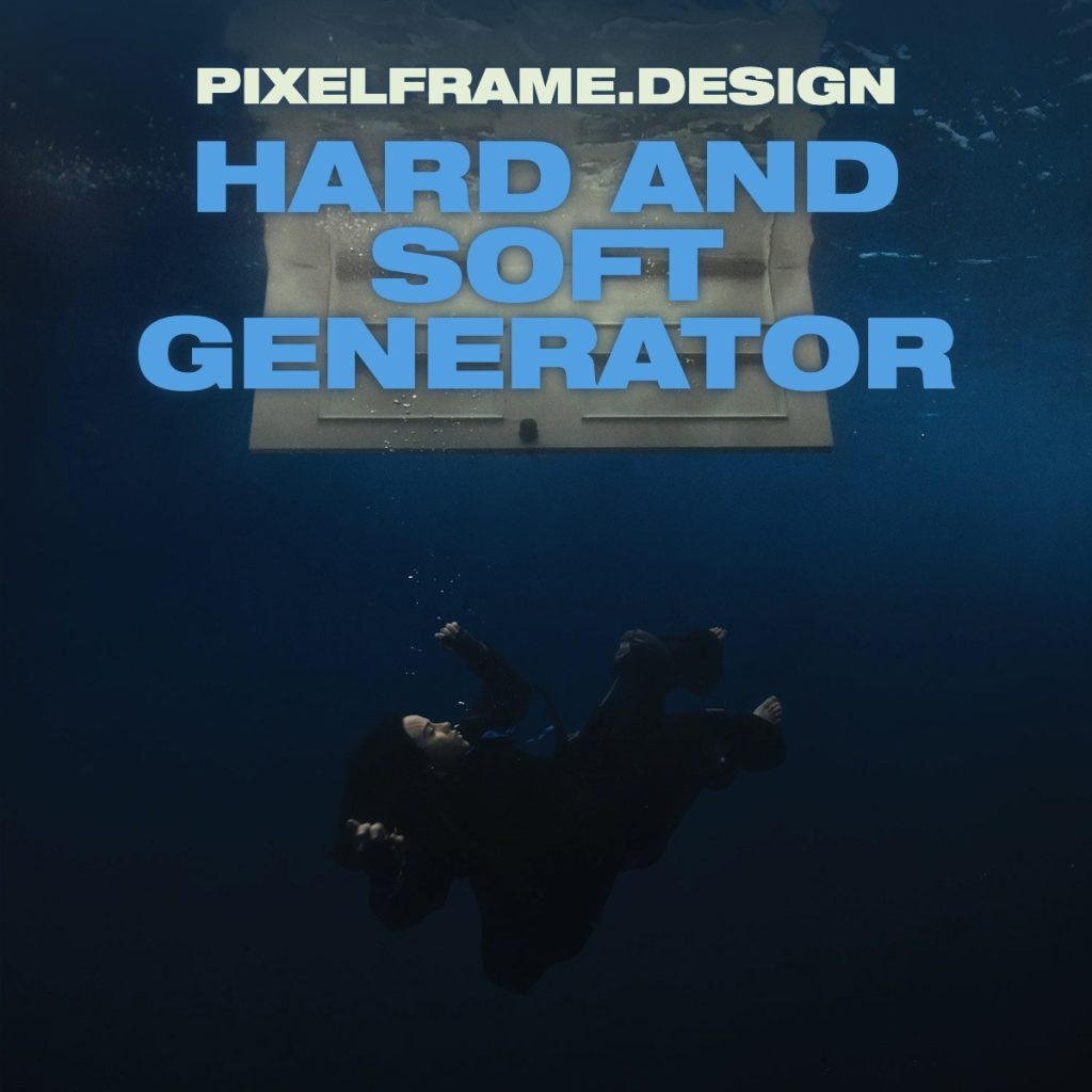
The generator offers two distinct modes for creating custom album cover designs. In Photo mode, text appears over the original underwater background image, positioned near the top of the canvas just as it appears on the official album artwork. PFP mode removes the background entirely, creating a solid dark blue canvas with centered text—ideal for profile pictures and social media graphics.
Enter an artist name in the first text field and an album or song title in the second field. The generator automatically adjusts text placement and sizing based on the length of the input, creating line breaks when necessary to prevent text from extending beyond the canvas boundaries. Both text fields use the Helvetica Black Extended font that defines the Hit Me Hard and Soft visual identity.
For exclusive early access to new album generators, please join our mailing list. No spam or ads, just simple email alerts when new generators are created.
The Submerged Aesthetic of Hit Me Hard and Soft
The Hit Me Hard and Soft album cover represents one of the most visually striking images in Billie Eilish’s catalog. Shot entirely underwater, the cover depicts Eilish floating in a deep blue void. This dreamlike composition creates immediate visual tension—the soft, intimate space of a bedroom juxtaposed against the hard, unforgiving environment of deep water.
The underwater photography technique recalls the work of fashion photographers like Ellen von Unwerth and music video imagery from artists like Lana Del Rey, whose “Mariners Apartment Complex” video similarly explored subaquatic symbolism. The floating bedroom imagery creates an uncanny quality that speaks to themes of vulnerability, isolation, and the blurred boundaries between consciousness and subconsciousness.
This visual approach marked a significant departure from the neon green and black aesthetic of Eilish’s debut album “When We All Fall Asleep, Where Do We Go?” and the blonde transformation era of “Happier Than Ever.” The underwater motif suggests emotional depth, the weight of feelings, and the sensation of being overwhelmed—visual metaphors that align with the album’s exploration of intense emotional states.
Helvetica Black Extended: The Typography of Emotional Impact
The Hit Me Hard and Soft album cover font employs Helvetica Black Extended, a bold, wide variation of one of the most ubiquitous typefaces in graphic design history. This particular weight and width of Helvetica creates maximum visual impact—each letter commands significant space, demanding attention without elaborate decoration or stylistic flourishes.
Helvetica Black Extended’s characteristics—extreme boldness, extended width, and clean geometric forms—make it ideal for album covers that need to maintain legibility at small sizes on streaming platforms while still creating strong brand recognition. The typeface’s Swiss modernist roots give it an inherent sense of authority and confidence, qualities that balance the vulnerable, submerged imagery.
The two-tone color treatment adds sophisticated visual hierarchy. The artist name appears in a soft sage green (#e4edd6), reading as almost luminous against the dark blue water. The album title renders in a vibrant sky blue (#52a0e2), creating the effect of text that seems to glow with its own light source. Both colors evoke underwater atmospheres—the green suggesting filtered surface light, the blue mimicking the color of shallow tropical waters.
This bold typographic approach connects to a broader trend in contemporary album design where artists like Tyler, The Creator have embraced confident, unapologetic typography. Tyler’s “IGOR” and “CALL ME IF YOU GET LOST” (including the deluxe Estate Sale version) albums similarly use bold sans-serif fonts as primary visual elements, proving that powerful typography can anchor album artwork without competing against photographic imagery.
Hit Me Hard and Soft: The Album
Released in May 2024, “Hit Me Hard and Soft” represents Billie Eilish’s third studio album and her most sonically cohesive project to date. Produced entirely by her brother Finneas O’Connell in their home studio, the album explores the dualities suggested by its title—strength and vulnerability, confidence and insecurity, love and loss. The ten-track record flows as a continuous listening experience, with songs bleeding into each other without traditional fade-outs.
The album’s sonic palette draws from various influences across Eilish’s musical universe. Tracks incorporate elements of the bedroom pop that defined her early career, the orchestral grandeur she explored on “Happier Than Ever,” and new experimental textures that push her sound forward. The production maintains the intimacy and whispery vocal delivery that became her signature while expanding into more dynamic territory.
Thematically, the album examines the complexity of modern relationships, the performance of identity in the digital age, and the emotional whiplash of growing up in public view. Songs address the conflicting desires to be both seen and hidden, strong and soft, available and protected—the emotional contradictions that define contemporary young adulthood.
Billie Eilish: Redefining Pop Stardom
Since emerging in 2015 with “Ocean Eyes,” Billie Eilish has consistently challenged conventional pop aesthetics. Born Billie Eilish Pirate Baird O’Connell in Los Angeles, she rose to prominence as a teenager with a sound and visual aesthetic that rejected the glossy production and styling typical of mainstream pop music. Her whispered vocal delivery, dark lyrical content, and oversized streetwear created a blueprint that influenced an entire generation of bedroom pop artists.
Eilish’s collaboration with Justin Bieber on the “Bad Guy” remix brought together two generations of pop innovation, with Bieber’s stamp of approval helping establish her crossover credentials. Her work has drawn comparisons to Lana Del Rey’s atmospheric production and melancholic lyricism, while her fearless approach to genre-blending echoes Tyler, The Creator’s refusal to be constrained by stylistic boundaries.
Billie’s connection to Vince Staples resulted in memorable collaboration and mutual creative respect, with Staples appearing on her “&burn” track. This partnership highlighted Eilish’s ability to move seamlessly between pop and hip-hop spaces, much like Tyler has done throughout his career. Her influence extends beyond music into fashion, with her distinctive style inspiring countless imitators and establishing her as a cultural icon beyond the recording studio.
Eilish has won seven Grammy Awards, including sweeping the “Big Four” categories in 2020—a feat accomplished by only two other artists in history. Her Bond theme “No Time to Die” won both the Academy Award and Golden Globe for Best Original Song, making her the youngest artist ever to write and perform a Bond theme. These achievements underscore her position as one of the defining artists of her generation.
Visual Identity Across Eras
Each Billie Eilish album era has brought distinct visual identity. The debut “When We All Fall Asleep, Where Do We Go?” featured neon green and black color schemes, distorted photography, and imagery that played with horror movie aesthetics. The “Happier Than Ever” era embraced Old Hollywood glamour with blonde hair, beige tones, and classic beauty photography that deliberately contrasted her earlier anti-glamour stance.
“Hit Me Hard and Soft” represents synthesis—underwater imagery that’s both beautiful and unsettling, bold typography that’s confident yet vulnerable, colors that evoke both warmth and coolness. The visual identity reflects artistic maturity, showing an artist comfortable enough in her creative vision to embrace contradictions rather than resolve them.
The album cover’s surreal quality connects to the broader tradition of dreamlike imagery in album art, from Pink Floyd’s floating objects to Radiohead’s abstract landscapes. Yet it remains distinctly contemporary, optimized for the square format of streaming platforms while maintaining the ambition of classic album artwork. The underwater bedroom creates an instantly memorable image that functions as both fine art photography and commercial product design.
Typography in Modern Album Design
The Hit Me Hard and Soft cover exemplifies a shift in album artwork toward bold typography as the primary design element. Where previous eras might have prioritized photography or illustration with subtle text treatment, contemporary album design often features text as the main visual component. This reflects both the practical demands of streaming platform thumbnails and a broader aesthetic movement toward graphic clarity.
Helvetica Black Extended’s use on this cover follows a lineage of bold sans-serif fonts in music branding. The typeface’s neutrality allows it to serve as a vessel for the album’s complex emotional content without imposing additional stylistic interpretation. Its extended width creates horizontal emphasis that balances the vertical format of the album cover, while its extreme weight ensures visibility at any size.
The subtle glow effect around the text—achieved through shadowing in the original design—creates depth and ensures legibility against the varied tones of the underwater photograph. This technical consideration demonstrates sophisticated design thinking, balancing artistic vision with functional requirements of modern music distribution.
Creating Connection Through Contradiction
The title “Hit Me Hard and Soft” encapsulates the album’s central tension and its cover’s visual strategy. The hard elements—bold typography, geometric letterforms, strong color contrast—exist in dialogue with the soft elements—underwater fluidity, dreamlike composition, emotional vulnerability. This contradiction creates resonance, inviting viewers to contemplate the relationship between strength and gentleness, assertion and surrender.
The underwater setting functions as perfect visual metaphor for emotional intensity. Water can be calm or violent, clear or murky, buoyant or crushing. The bedroom floating in this space suggests intimate privacy made public, personal space rendered surreal and strange. These visual tensions mirror the emotional landscape explored throughout the album—the collision of opposing forces that define human experience.
The Hit Me Hard and Soft album cover generator allows fans to engage with this visual language, creating their own interpretations of the album’s aesthetic. By inputting personal text into the design framework, users participate in the album’s themes of identity, performance, and self-expression. The generator becomes a tool for connection—between artist and audience, between visual design and musical content, between individual creativity and shared cultural experience.
Billie Eilish’s third album and its striking cover art represent a milestone in contemporary pop visual identity. The underwater photography, bold Helvetica typography, and carefully considered color palette create an image that’s both immediate and mysterious, confident and vulnerable—hit hard and soft, all at once.


nothing