
Enter your text in the box below the image and click “Generate Cover”.
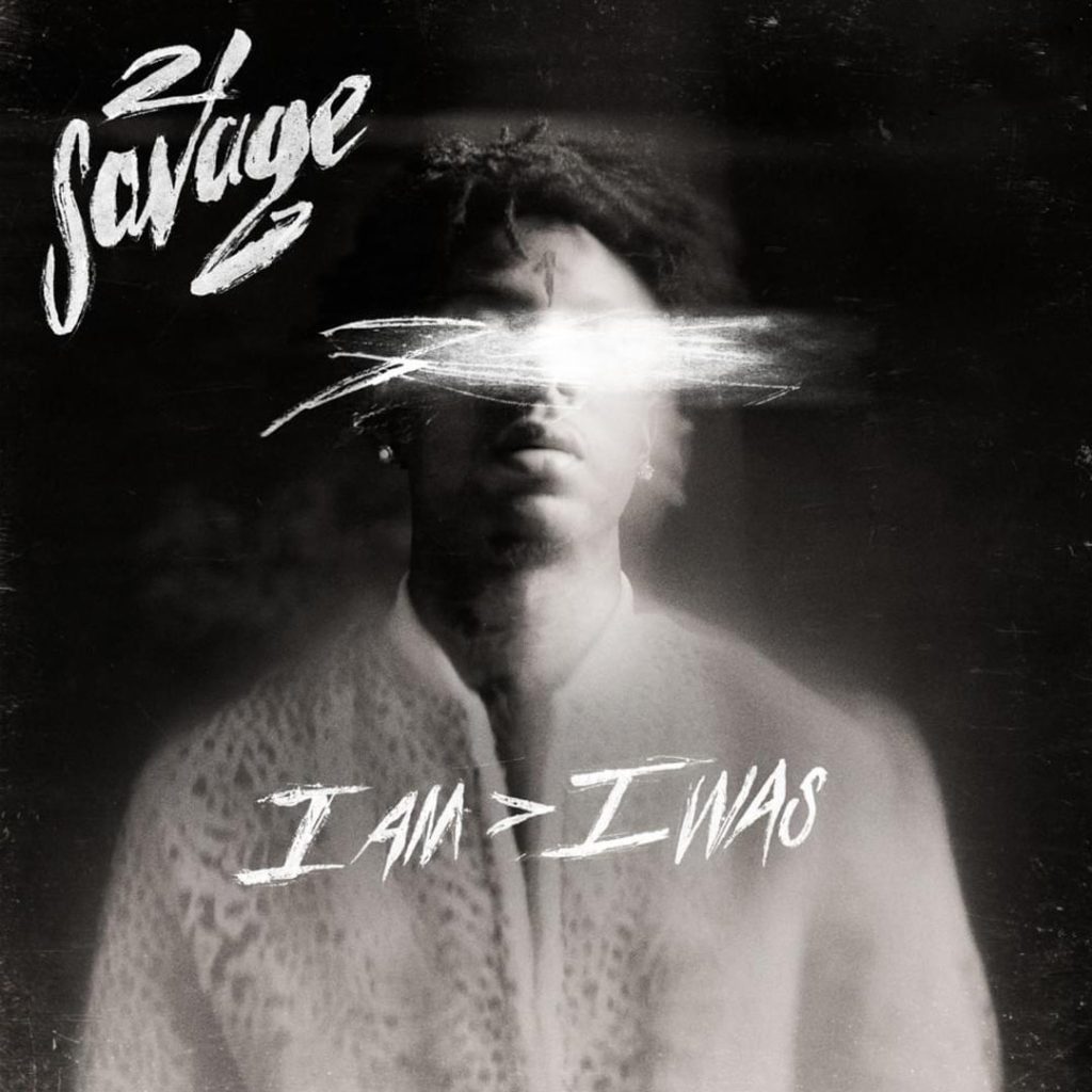
Create your own version of the album cover for I AM > I WAS by 21 Savage. The original features custom hand-writing (probably from 21 Savage), so instead we’ve opted for a scratch-style hand-written font called Patrick Scratch.
Remember to tag us on social media with your creations: X Facebook Instagram and TikTok
As always, if there’s specific album generator you’d like to see, please let us know.
sample text
For exclusive early access to new album generators, please join our free mailing list. No spam or ads, just simple email alerts when new generators are created.
This ad helps keep the website free.
The Visual Aesthetic of 21 Savage’s “I AM > I WAS” Album Cover: A Study in Minimalist Hip-Hop Design
The album cover for 21 Savage’s 2018 breakthrough project “I AM > I WAS” stands as a masterclass in minimalist visual storytelling within hip-hop. Shot by acclaimed photographer Gunner Stahl, the cover features the Atlanta rapper seated against a stark white background, dressed in all black, creating a powerful visual contrast that mirrors the album’s introspective themes.
Minimalism Meets Vulnerability
Unlike the bold, in-your-face approach often seen in hip-hop album art, “I AM > I WAS” embraces restraint. The clean white backdrop strips away all distractions, forcing viewers to focus solely on 21 Savage himself. This minimalist aesthetic has influenced a wave of contemporary artists who’ve similarly embraced stripped-down visuals, from the atmospheric melancholy of d4vd‘s ethereal bedroom pop presentations to the refined simplicity found in Vince Staples‘ recent visual campaigns.
The seated pose conveys vulnerability—a departure from traditional hip-hop posturing. This introspective approach to visual identity aligns with artists like J Cole, who has consistently favored understated album artwork that prioritizes substance over flash.
Color Theory and Emotional Depth
The stark black-and-white color palette serves multiple purposes. Black represents 21 Savage’s past—the street life, the losses, the darkness he emerged from. White symbolizes clarity, growth, and the blank slate of his evolved identity. This duality reinforces the album’s central thesis captured in its title: the person he has become is greater than who he was.
This sophisticated use of color contrast resonates with how artists like Kali Uchis approach visual branding, using bold color choices and clean compositions to communicate complex emotional narratives. The monochromatic scheme also ensures the cover remains timeless, avoiding trendy design elements that might date the project.
Typography and Statement Design
The bold, capitalized title “I AM > I WAS” dominates the lower portion of the cover in a clean sans-serif font. The mathematical symbol “>” (greater than) serves as both a visual anchor and philosophical statement. This typographic confidence—letting simple, powerful text do the heavy lifting—reflects a design philosophy shared by many contemporary hip-hop artists who understand that sometimes less truly is more.
Photography and Composition
Gunner Stahl’s photography emphasizes raw authenticity. The lighting is natural and unflattering in its honesty, avoiding the high-gloss treatment that might obscure 21 Savage’s genuine expression. His direct gaze into the camera creates an intimate connection with viewers, inviting them into his personal evolution.
This documentary-style approach to album photography has become increasingly popular among artists seeking to establish authentic connections with their audiences, influencing everyone from rising alternative artists to established hip-hop veterans looking to showcase their artistic maturity.
Cultural Impact and Legacy
The “I AM > I WAS” cover helped establish a template for how hip-hop artists could present personal growth and vulnerability through visual design. Its influence can be traced through subsequent releases that prioritize emotional honesty over aggressive posturing. The cover’s success proved that hip-hop audiences respond to authenticity and that powerful visuals don’t require elaborate staging or expensive production.
In an era where album covers compete for attention on streaming platforms with thumbnail-sized displays, 21 Savage’s simple yet striking design demonstrates the enduring power of clean composition, meaningful symbolism, and honest self-presentation. The cover remains a reference point for artists across genres seeking to communicate transformation and growth through visual identity.
More album cover generators:


This ad helps keep the website free.