The Hunger Games Font and Logo Generator is here with New and Classic Versions.
Type your own words and turn them into a Hunger Games logo. Choose the classic movie lettering (metallic gold) or the new Sunrise on the Reaping style (purple with silver outline), stack your text on separate lines, add a subtitle and download with your selected background image.
For exclusive early access to new album generators, please join our mailing list. No spam or ads, just simple email alerts when new generators are created.
Few movie titles are as recognizable as The Hunger Games: big, square, gold capital letters with a small "THE" sitting on top. The same lettering has run across five films so far, and in November 2026 it returns in a new color for The Hunger Games: Sunrise on the Reaping, the story of Haymitch Abernathy's Games.
This Hunger Games font generator lets you make your own version of either one. Type your words, choose the classic gold movie style or the purple Sunrise on the Reaping style, and download your logo as a high-resolution image. Use it for a name, a team, a birthday sign or a watch party for the new movie.
What Font Is the Hunger Games Logo?
The Hunger Games logo is set in Bank Gothic Medium. Bank Gothic was designed by Morris Fuller Benton for American Type Founders and released in 1930. Benton drew it as a capitals-only typeface, with letters built almost entirely from straight lines and squared-off curves, so an O looks more like a rounded rectangle than a circle. Digital versions later filled the lowercase keys with smaller capitals, which is why the whole logo reads as uppercase.
That squared, engineered look has made Bank Gothic a favorite for anything meant to feel official, military or futuristic, and it suits Panem well. Wide, hard-edged capitals have become the shorthand for screen dystopias in general, from the Blade Runner logo to the Cyberpunk 2077 title. The Capitol is a government that runs the Games like a broadcast event, and its title looks like something stamped onto a monument. The generator sets your text in the same block capitals, so a name like "Katniss" or "District 12" comes out with the same proportions as the movie title.
The Hunger Games Logo, from Book Covers to Movie Posters
Before there was a movie logo, there was the mockingjay. Illustrator Tim O'Brien painted the covers of Suzanne Collins's original trilogy for Scholastic between 2008 and 2010, working with Scholastic's creative director Elizabeth Parisi, and his gold mockingjay pin became the series' symbol. When Lionsgate made the first film in 2012, it used O'Brien's mockingjay on the movie poster and as the pin Katniss wears on screen.
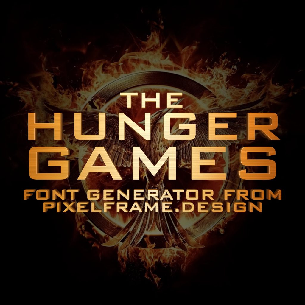
The film added the title treatment most people now picture: "THE HUNGER GAMES" in heavy gold Bank Gothic capitals, with "THE" set much smaller above the main words. The finish looks like brushed metal, with an amber glow at the ends of the words and a pale, almost white shine in the middle. Catching Fire (2013), the two parts of Mockingjay (2014 and 2015) and The Ballad of Songbirds and Snakes (2023) all kept the same lettering for the series name and added their own subtitle underneath, so the logo turned into a family resemblance across the whole franchise.
The Sunrise on the Reaping Logo
The Hunger Games: Sunrise on the Reaping adapts Collins's 2025 novel about the Second Quarter Quell, the 50th Hunger Games, which a young Haymitch Abernathy survives. Francis Lawrence directs, Joseph Zada plays Haymitch, and the film opens in theaters on November 20, 2026. Lionsgate first showed the title as an animated logo teaser at CinemaCon in 2025, with the snake and bird from the book cover wrapping around a rising sun.
The lettering is the same Bank Gothic block capitals, but the finish is completely new. Instead of gold, the letters have a pale pink-lilac face with a worn, slightly weathered texture, a thin light outline around each letter, and a dark line along the inside edges that makes the face look set back. The 3D depth is almost gone, and the letters are spaced a little wider.
Classic Gold vs. Sunrise on the Reaping: Two Hunger Games Font Styles
The classic style recreates the original movie title. The letters have a brushed gold face that runs from amber at the edges of the word to a pale cream shine in the middle, with a bright line along their front edges. Behind each letter you can see its sides, angled toward the center of the text, which gives the logo its solid, cast-metal depth.
The Sunrise on the Reaping style is lighter and flatter. Each letter has a pale lilac face with fine scuffs and specks, a dark inner edge along the top and left sides, and a thin light outline around the outside. It looks best on dark purple and black, while the classic gold works on almost anything dark. Having an old and a new version of the same logo in one place works the same way as our Harry Potter font generator, which switches between the classic film logo and the new HBO series style.
How to Make Your Own Hunger Games Logo
The generator has four text boxes, one for each part of the logo. The first is the small line on top, like "THE." The second and third are the big main lines, and the last is the subtitle underneath, like "Catching Fire" or "Sunrise on the Reaping." Leave any of them empty and the layout closes up around the rest. Everything is set in capitals, the way the logo is, no matter how you type it.
The two main lines are sized to match each other's width, which is how the real logo stacks "HUNGER" over "GAMES": the shorter word gets bigger letters, so both lines end up the same width. A very short second line is capped so it can't take over the whole image.
Long text shrinks to fit, but only down to a minimum size. After that it moves onto extra lines instead of getting any smaller, with the lines balanced so one word isn't left on its own. That keeps a long title or a full sentence readable. Choose Classic or Reaping with the button next to the first box, press Generate, and press Download to save your logo as a 2400 by 2400 pixel JPG. You can also put your design on a T-shirt straight from the preview.
Hunger Games Logo Ideas
Start with your own name in the main lines and your district in the small top line, then add "May the Odds Be Ever in Your Favor" as the subtitle. It works for birthday party signs, book club posters and classroom reading challenges, and the Sunrise on the Reaping style is an easy way to dress up an invitation to see the new movie. Team names, fantasy league banners and office trophies all look better in heavy gold capitals.
If it's the deadly competition you're after, the Squid Game logo generator recreates another famous survival-game title. For a darker sci-fi poster, the Cyberpunk Edgerunners font generator has another future where the powerful run the show. Or try the Star Wars font generator for movie lettering on a bigger scale, and the Stranger Things font generator for a dark, glowing red title.