The Interstellar Logo Generator
Christopher Nolan’s 2014 film Interstellar is remembered for many things — its breathtaking depictions of black holes, its emotionally devastating third act, the thunderous organ swells of Hans Zimmer’s score, and abysmal sound mixing – making that aforementioned third act largely unintelligible. But from a purely visual standpoint, one of the film’s most quietly brilliant design decisions was its title treatment: a single word, set in an elegant serif typeface, stretched across a dark background with a clean split between white and black letters.
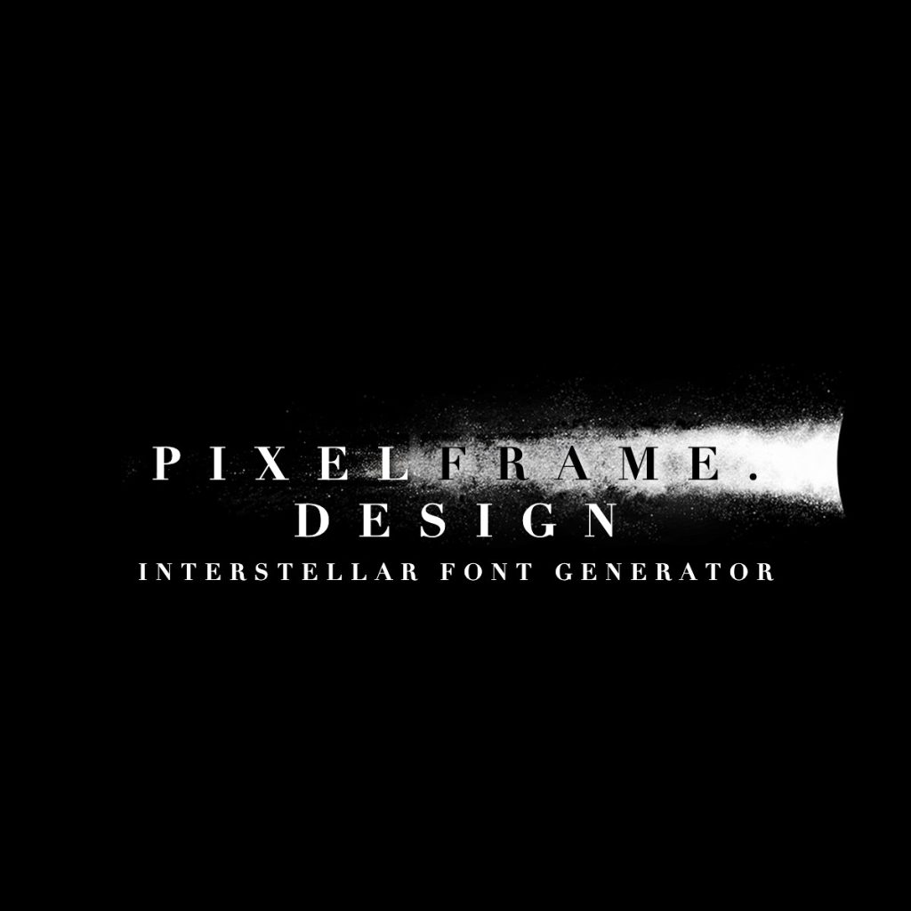
This generator recreates that effect. Type any main text and optional subtitle, and your words will be rendered in the same typeface and style used in the film’s promotional materials and title cards.
For exclusive early access to new album generators, please join our mailing list. No spam or ads, just simple email alerts when new generators are created.
The Typography Behind the Title
The Interstellar wordmark uses Linotype Didot Bold, a contemporary variant of the Didot typeface family that has been a cornerstone of editorial and luxury design for more than two centuries. Didot was developed by the French typographer Firmin Didot around 1800, and it belongs to the Didone classification of type — defined by extreme contrast between thick and thin strokes, perfectly vertical stress, and hairline serifs with no bracketing.
That extreme stroke contrast is exactly what makes Linotype Didot so well-suited for the Interstellar logo. The thin connecting strokes between letterforms give the word a fragile, almost spectral quality — the kind of typography that reads as simultaneously ancient and futuristic. It is a typeface that feels like it belongs to a different time, which aligns perfectly with a film about time dilation, memory, and the long arc of human survival.
The wide letter-spacing applied to the word INTERSTELLAR amplifies this effect considerably. Each character is given room to breathe, preventing the thin strokes from colliding visually and reinforcing the cold, expansive atmosphere the design team was building toward. The sparse layout echoes the vacuum of space itself — immense distances between objects, silence between notes.
The White and Black Letter Split
The most distinctive feature of the logo is the way letters transition from white to black as they cross the centre of the composition. In the original title card, this transition is tied to a streak of light — a lens flare or nebular glow — that cuts horizontally through the word. Letters to the left of that light source appear white against the dark background; letters to the right shift to black as the background brightens behind them.
The result is a single word that contains its own contrast reversal. It is an unusually sophisticated typographic device: the same letterforms rendered simultaneously in positive and negative space, unified by the horizontal sweep of light. It suggests a threshold — a point of no return — which maps neatly onto the film’s central narrative of astronauts crossing the boundary beyond which they cannot communicate with the people they love.
In this generator, the split point between white and black letters is controlled by a configurable position across the canvas. Each complete letter falls entirely on one side of that threshold, maintaining the clean character-level transition of the original design.
About the Film
Released in November 2014, Interstellar was co-written by Christopher and Jonathan Nolan and stars Matthew McConaughey as Cooper, a former NASA pilot tasked with leading a crew through a wormhole near Saturn in search of a habitable world for humanity. Notably the film also features a pre-Dune Timothée Chalamet (who was apparently very disappointed when seeing the final cut of the film, as his role had been considerably reduced in screen-time) The film draws heavily on the theoretical physics work of Kip Thorne, a Caltech astrophysicist who served as executive producer and scientific consultant. The depiction of Gargantua, the film’s central black hole, was the first scientifically accurate simulation of a black hole rendered for the screen, and the work generated two academic papers in the process.
The film earned five Academy Award nominations, winning for Best Visual Effects. It grossed over $700 million worldwide and has grown considerably in cultural stature since its release, now frequently cited as one of the defining science fiction films of its decade.
Nolan shot the film on a combination of 35mm and IMAX film stock, a deliberate choice rooted in his longstanding commitment to analog capture. The production design by Nathan Crowley emphasized practicality wherever possible — the spacecraft interiors were built as physical sets, and the team traveled to Iceland and Canada to shoot the alien planet sequences on location. This physical groundedness in the filmmaking process mirrors the Didot typeface choice: something classical and tangible used to frame the extraordinary.
Hans Zimmer and the Sound of the Logo
It is worth noting that the Interstellar visual identity and its accompanying sound design are unusually tightly coupled. Zimmer’s score, built around a massive church organ recorded at Temple Church in London, shares several qualities with the Linotype Didot typography. Both are austere. Both derive power from restraint rather than ornamentation. Both carry a sense of vast time — the organ as an instrument associated with cathedrals and centuries, the Didot typeface as a design artifact of the Enlightenment era repurposed for a story set in the far future.
The title sequence itself uses typography and sound together to establish the film’s emotional register long before a single scene has played. The wide-tracked serif letterforms expanding slowly across a black field, accompanied by Zimmer’s opening tones, creates a specific feeling — something between wonder and dread — that the rest of the film then spends nearly three hours earning.
Using the Generator
The main text input renders your words in Linotype Didot Bold with widetracking between each character. Letters whose centers fall to the left of the split point are drawn in white with a subtle black drop shadow; letters to the right appear in black with a white drop shadow. If your text wraps to a second line, the additional lines render in plain white below the first.
The subtitle input uses the same typeface at a smaller size and appears centred beneath the main text in white. It is designed for a secondary line of context — a director credit, a date, a tagline — in the same style as the film’s theatrical poster typography.
Both inputs automatically convert to uppercase, matching the all-caps treatment used in the original wordmark. Once generated, the image can be downloaded as a JPEG directly from the page.
If the Interstellar aesthetic appeals to you, the minimalist cinematic approach carries through to several other generators on the site. The A Clockwork Orange font generator is another landmark of auteur film typography, using the distinctive geometric lettering from Stanley Kubrick’s 1971 film. For a different brand of atmospheric science fiction, the Stranger Things logo generator recreates the ITC Benguiat-driven retro title treatment from the Netflix series. The Fallout logo generator offers a similarly dark and cinematic aesthetic rooted in post-apocalyptic design.
The Legacy of the Interstellar Logo
Film title design has produced a long lineage of typographic landmarks — from the hand-drawn Saul Bass compositions of the 1950s and 60s to the stark Impact wordmarks of early 2000s action cinema. The Interstellar title card sits in its own register: not flashy or heavily manipulated, but deeply considered. It earns its impact through the quality of the typeface selection, the precision of the letter-spacing, and that single formal device of the colour split.
It is the kind of design that reveals itself gradually. On first viewing, it reads simply as an elegant title. Over repeated exposure, the logic of the light-and-dark split becomes more apparent, and the connection between the typography and the film’s themes grows clearer. The letters themselves are crossing a threshold. Half of them have already crossed into darkness.