
The Eminem Show
Eminem
Rap
2002
The Artistic Brillance of ‘The Eminem Show’ Album Cover
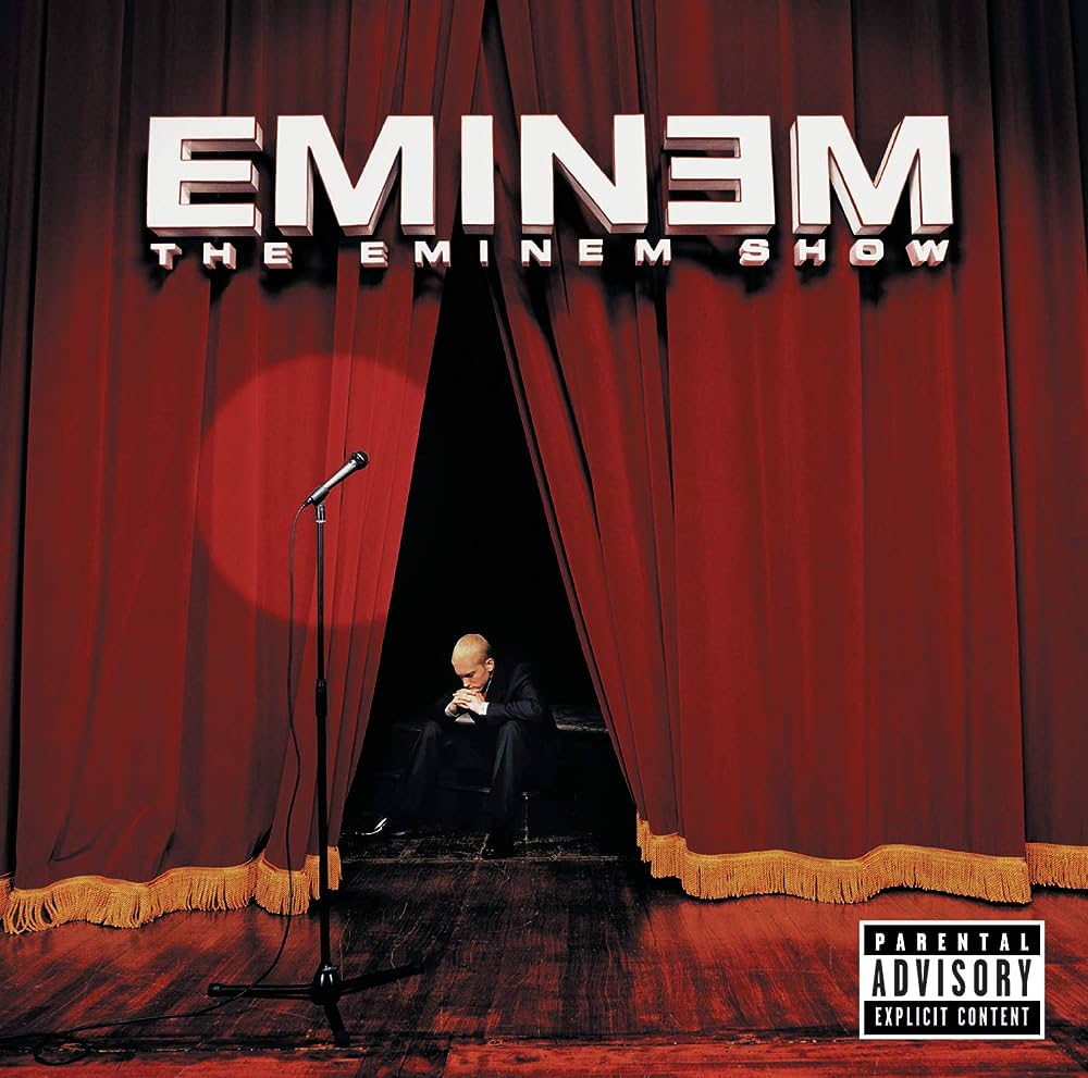
‘The Eminem Show’ album cover is a striking piece of art that captures the essence of the music and the artist behind it. Released in 2002, this album marked a pivotal moment in Eminem’s career, and its cover art plays a key role in setting the stage for the auditory experience within. This review examines various aspects of the cover art, exploring its composition, color scheme, stylistic elements, and typography, while providing insights into its significance and effectiveness.
Composition
The composition of ‘The Eminem Show’ album cover is both visually captivating and metaphorically rich. At the forefront, we see a lone microphone on a stand, centered under a spotlight that pierces through the dimly lit theater. The open curtains reveal Eminem himself, sitting contemplatively in the background. His pose, with his head bowed and hands clasped, evokes a sense of deep introspection, suggesting a moment of vulnerability amidst his public persona.
The spatial arrangement guides the viewer’s eye from the microphone, a symbol of performance and public scrutiny, to Eminem, representing the man behind the music. This transition from the public to the private is masterfully achieved, creating a narrative arc that is both engaging and thought-provoking. The symmetry of the curtains and the spotlight adds a sense of balance, drawing attention to the central elements without overwhelming other details.
Color
The dominant color on the album cover is a deep red, conveyed through the stage curtains. Red is a color often associated with passion, intensity, and emotion, all of which are central themes in Eminem’s music. The richness of the red curtains contrasts sharply with the darkness of the stage and the subtle spotlight, highlighting the microphone and the artist himself.
The use of shadows and highlights adds depth to the image, enhancing the realism of the stage setting. The golden tassels at the bottom of the curtains provide a touch of elegance, juxtaposing the raw and unfiltered nature of the artist’s lyrics. This careful selection of colors not only grabs attention but also evokes specific emotions, preparing listeners for the emotional journey of the album.
Style
‘The Eminem Show’ album cover employs a realistic style, reminiscent of a theatrical production. This stylistic choice aligns with the album’s title and theme, suggesting that the audience is about to witness a performance. The realism is achieved through meticulous attention to detail, from the texture of the curtains to the wood grain of the stage floor.
While the image is grounded in reality, it also possesses a certain stage-like quality, blurring the lines between reality and performance. This duality mirrors Eminem’s career, where his public persona often intermingles with his private life. The cover’s style serves as a visual metaphor for this interplay, inviting viewers to look beyond the surface and understand the complexities of the artist.
Typography
The typography used on ‘The Eminem Show’ album cover is bold and impactful. The artist’s name, “EMINEM,” is displayed prominently at the top in a clean, upper-case font that demands attention. The choice of font, likely a variant of Helvetica Neue Bold Extended, enhances the modern and professional appearance of the album cover.
Below the artist’s name, the album title “THE EMINEM SHOW” is presented in a smaller yet equally bold font, creating a visual hierarchy that emphasizes the artist first, followed by the album title. The white text against the deep red curtains ensures readability while maintaining a cohesive color scheme. The typography’s simplicity and clarity resonate with Eminem’s straightforward and unfiltered lyrical style, effectively tying the visual and auditory elements together.
Symbolism and Themes
The cover of ‘The Eminem Show’ is laden with symbolic elements that reflect the album’s themes. The microphone stands as a symbol of Eminem’s career and the power of his voice. Its central position under the spotlight indicates the scrutiny and attention his work receives. The open curtains suggest transparency, hinting at a revealing, unguarded look into Emin Isic.
Our final thoughts
The early 2000’s was not a great time for album art, or digital art in general. Adobe Photoshop was still in its infancy, and it was the wild west in terms of photo manipulation. The Eminem Show cover was able to avoid the ugly styles that were mainstream at the time and give us a relatively minimalist composition that still looks good by modern standards (though the 3-D font effect is very Y2k’ish). With thoughtful elements, a cohesive color scheme, and intriguing symbolic imagery, it’s a solid cover for a classic album.
8