
Certified Lover Boy
Drake
Hip-hop
2021
Analyzing Drake’s “Certified Lover Boy” Album Cover: A Visual Masterpiece or a Missed Opportunity?
Album covers have long been a canvas for artistic expression, representing the spirit of the music within. Drake’s “Certified Lover Boy,” with its unique and somewhat controversial cover art, has attracted a lot of attention. Let’s explore the composition, color, style, and typography of this album cover to uncover its artistic value.
Composition
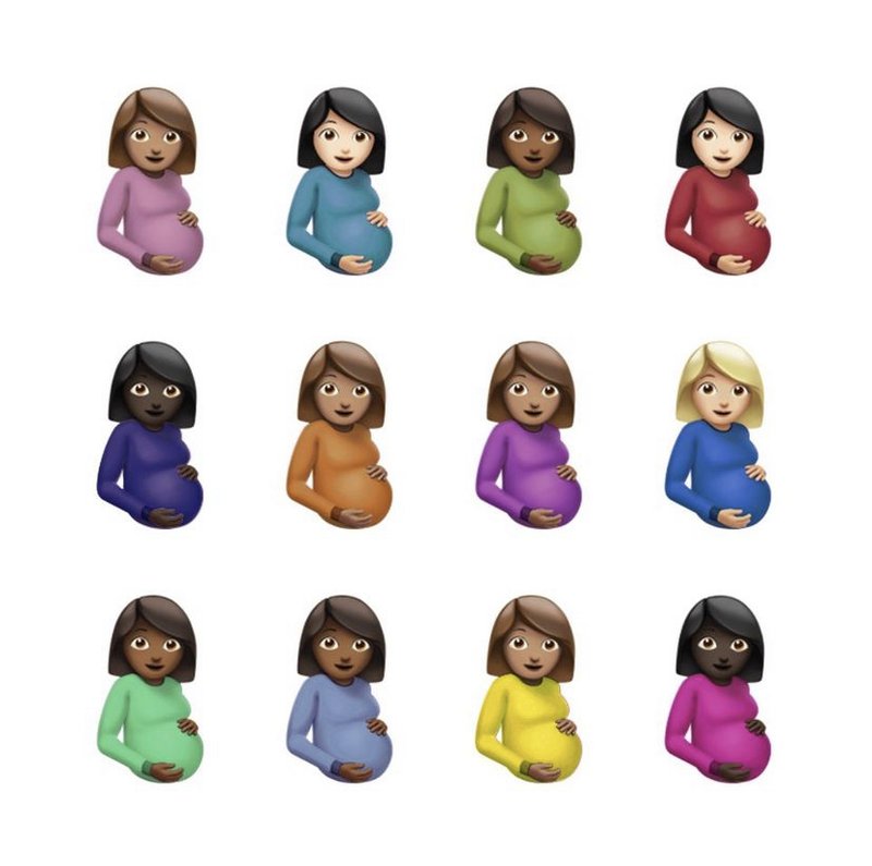
The composition of Drake’s “Certified Lover Boy” album cover is both simple and complex. The cover features twelve pregnant woman emojis arranged in a 4×3 grid. This grid creates a sense of order and balance, inviting the viewer’s eye to explore each individual emoji. The repetitive nature of the imagery suggests a thematic consistency, possibly hinting at themes of fertility, growth, or the multifaceted nature of love.
The uniformity of the composition can be seen as both a strength and a weakness. While it provides a clear and coherent structure, it may lack the dynamism and variety that some might expect from album art. The choice of using emojis, a modern and universally recognized symbol, brings an element of contemporary culture into the mix, but it might also be perceived as too simplistic or even lazy by art purists.
Color
Color plays a significant role in this album cover. The cover boasts a diverse palette, with each emoji sporting different skin tones and clothing colors. This variety can be seen as a celebration of diversity, reflecting the inclusive nature of Drake’s music. The use of bright, vivid colors for the clothing contrasts nicely with the more muted skin tones, creating a visually pleasing balance.
The white background further enhances this effect by providing a clean slate that allows the emojis to pop. Some may argue that the white background is too stark and lacks the depth that a more textured or colored background could provide. This choice, though, makes the cover instantly recognizable and easily memorable, which is often a goal for album art.
Style
The stylistic choice of using pregnant woman emojis is unconventional and provocative. Emojis are typically associated with casual digital communication, not high art. By placing them front and center on an album cover, Drake blurs the lines between digital culture and traditional artistic expression. This bold move challenges the viewer to rethink their preconceptions about what constitutes art.
This choice is not without its critics. Some might find the use of emojis to be too gimmicky or superficial. The cover’s minimalist approach, devoid of complex graphic elements or detailed illustrations, might be seen as a lack of effort in some circles. Yet, this minimalist style aligns with modern design trends that favor simplicity and clarity over complexity.
Typography
Interestingly, the “Certified Lover Boy” album cover does not prominently feature any typography. This omission is a statement in itself. By choosing to forgo traditional text elements like the album title or artist’s name, the cover relies solely on its visual impact. This decision emphasizes the universal and immediate recognizability of the emoji symbols.
While this approach might work for an artist as globally recognized as Drake, it could be a risky move for lesser-known artists who rely on text to establish their brand. The absence of typography forces the viewer to focus entirely on the imagery, which can be both a strength and a weakness, depending on one’s perspective.
Conclusion
Drake’s “Certified Lover Boy” album cover is a bold and unconventional piece of art that invites a range of reactions. Its composition is orderly yet repetitive, its color palette diverse yet balanced, its style minimalist yet provocative, and its typography notably absent. Whether you see it as a masterpiece or a missed opportunity, there’s no denying its impact on the visual landscape of contemporary music.
Final score
A big swing and a bigger miss – they tried to capitalize on Drake’s meme-ability, somehow thinking it could be channeled into album art, and it failed spectacularly. It was bad on release day and will be seen more negatively as more time passes.
1