Taylor Swift’s album “The Tortured Poets Department” has captivated fans not just with its music, but also with its distinctive visual aesthetic.
At the heart of this visual identity are the carefully chosen fonts that adorn the album’s cover and promotional materials. These typographic elements do more than just spell out words – they set the tone for Swift’s latest musical journey, hinting at themes of literary angst and poetic introspection. For creating your own cover in the TPD style, try out our art generator here. And we have one for “Reputation” too.
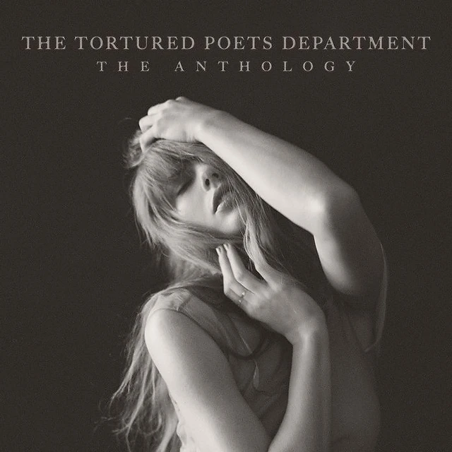
Main Tortured Poets Department logotype font
The font used for the album title and main branding is a modified version of Big Caslon by Carter & Cone. The reason it doesn’t look identical is because the designer has altered it slightly: specifically it looks like the ligature angles have been rounded and the weight of the letter crossbars have been adjusted.
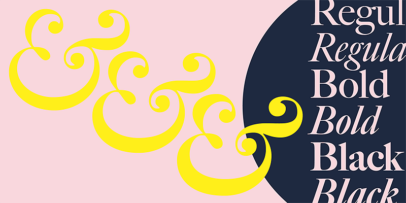
Inspecting the code on taylorswift.com makes it clear that Big Caslon is primarily used, specifically the Creative Cloud version from Adobe’s Typekit.
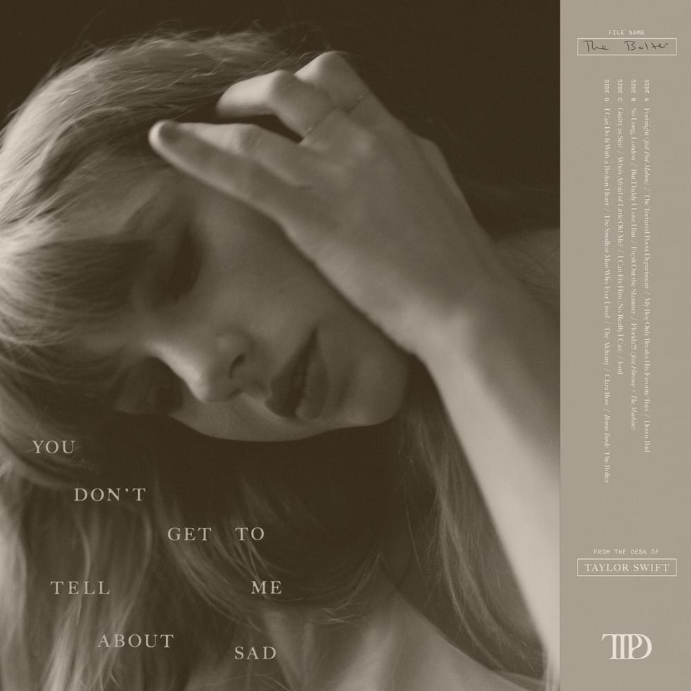
Supplementary fonts for The Tortured Poets Department
As a secondary branding element, the font Nitti Typewriter is used as an accent, but on album art and on the official website.