
The release of Eminem’s 12th studio album The Death of Slim Shady gives us another reason to explore the artists visual history.
Eminem, one of hip-hop’s most iconic and controversial figures, has always understood the power of visual imagery to complement his razor-sharp lyrics. His album covers and associated artwork have often been as provocative and attention-grabbing as the music itself. His latest work “The Death of Slim Shady” continues this tradition, paying homage to some of his earlier album covers as well as introducing fresh elements. Let’s break down the visual art and design used on the album and associated branding.

The Death of Slim Shady
While the “Slim Shady” text is likely handwritten and digitized (based on the original Slim Shady LP cover text back in 1999), “THE DEATH OF” is Alternate Gothic with some custom modifications: specifically the mirroring slants of the crossbars on both H letters, and the dripping effect. If you’d rather not mess with modifying a font to recreate the logo, we’ve got you covered with a perfect recreation of the logo on our Etsy store here.

Slim Shady custom text generator
Not only have we made our own custom Slim Shady Text font, but we also created a “My Name Is” social media graphic generator that you can use here. Simply type in any custom text you want (like your name) and get an image in the style of the iconic “My Name Is” single artwork. Post it on social media or anywhere else.

The evolution of the Eminem logo
If you’re an Eminem fan (or “stan”, as they’re often called) you’ve noticed the evolution of his brand mark over the years. Sometimes subtley, it has changed a bit since it was first introduced in 1996:
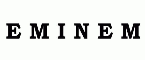
1996
Eminem’s first logo appeared on his debut album “Infinite”. It featured a simple all-caps wordmark in Bookman Old Style Bold, a serif font.
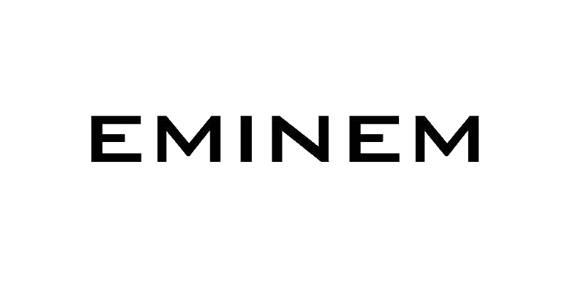
1997
Introduced a new, modernized version that starts to show some of the character for which it’s known today (no backwards E yet though)
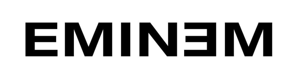
1999
The logo got a bold redesign with the introduction of the stylized “E” that would remain a frequently used brand-mark for the rest of his career. While Helvetica Neue may not be the cutting-edge of modernity anymore, in 1999 it wasn’t as “known” as it is today.
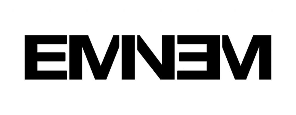
2013
The reaction was a bit mixed, but 2013 saw the introduction of a more condensed version of the logomark, this time removing some ligatures and updating the font to Pragmatica, while still retaining the backwards E.
Houdini single art font
The promotional materials for The Death of Slim Shady featured a different visual theme for the first single “Houdini”. Seemingly abandoning the murder mystery motif that was being used in promo previously, the single art went with a vintage magic style, utilizing a slightly modified version of the font Quorthon Black.
