Enter your text in the box below the image and click “Generate Cover”.
Although Kanye has released the cover art and the Bully logo font treatment separately, we’ve yet to see what the combined final cover will look like (or even if there will be a version, or a cover at all, or an album at all, knowing Kanye). This generator showcases a possible arrangement, and will be updated if/when an official version is revealed. For a simplified version (great for avatars and profile pics) use the Bully PFP Generator here.
The font used in the Bully text logo is Luke Thick400, a great modern black-letter font similar to the one used on Vultures.
If you’re looking for a vector version of the logo you can get that here on our Etsy shop.

sample text
For exclusive early access to new album generators, please join our mailing list. No spam or ads, just simple email alerts when new generators are created.
The Evolution of Kanye West’s Album Cover Aesthetic
Kanye West’s approach to album artwork has consistently pushed boundaries and sparked conversation throughout his career. The Bully album cover continues this tradition, showcasing a stark departure from the minimalist design of recent projects while harking back to the gothic, medieval-inspired typography that defined his Vultures era. This album cover text generator allows fans to participate in the creative process, customizing the Bully artwork with their own text while maintaining the distinctive visual language that makes Kanye’s covers instantly recognizable.
The blackletter font style used in the Bully logo represents a fascinating evolution in Kanye’s visual identity. Unlike the bear mascot that characterized Graduation or the heart imagery of 808s & Heartbreak, the Bully aesthetic leans into a raw, almost medieval darkness. This gothic typography creates an immediate visual impact that stands in stark contrast to the baroque maximalism of My Beautiful Dark Twisted Fantasy or the stripped-down minimalism of Yeezus.
Blackletter Typography in Hip-Hop Album Covers
The use of blackletter fonts in hip-hop isn’t entirely new, but Kanye’s implementation on both Vultures and now Bully has brought this typographic style back into mainstream hip-hop discourse. These fonts, which originated in medieval manuscripts, carry connotations of authority, tradition, and a certain edge that aligns perfectly with the “Bully” concept. The Luke Thick400 font used in the logo strikes a balance between historical gravitas and modern design sensibilities, creating something that feels both timeless and contemporary.
This stands in interesting contrast to how other artists like Drake have approached their visual branding. Drake’s album covers typically favor photography, emotional portraiture, and clean, modern typography. Compare the photographic intimacy of Nothing Was the Same or the baroque painting aesthetic of Her Loss with Kanye’s text-heavy, symbol-driven approach. Where Drake invites listeners in through personal imagery, Kanye creates iconic symbols and logos that become cultural touchstones in their own right.
From Late Registration to Bully: A Visual Journey
Looking back at Late Registration (2005), we see Kanye working with traditional album cover photography, featuring himself outside a building with a collegiate aesthetic that matched the album’s themes. The design was relatively conventional for its time, though the attention to detail and color grading showed Kanye’s already-developing interest in visual presentation.
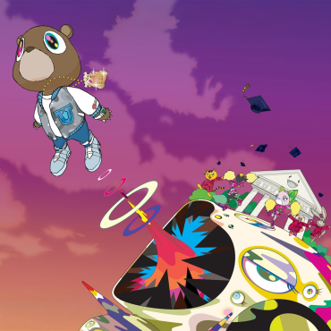
Fast forward to Graduation (2007), and we see Kanye fully embracing illustrated artwork, collaborating with Japanese artist Takashi Murakami to create the now-iconic Dropout Bear artwork. This marked a pivotal moment—Kanye wasn’t just making album covers; he was creating art objects that could stand alone. The vibrant, playful aesthetic of Graduation proved that hip-hop album art could be as ambitious and conceptual as any contemporary art installation.
The Bully album cover generator captures this same spirit of artistic ambition while allowing for personal customization. Whether you’re creating social media profile pictures, playlist covers, or just having fun with the design, this tool puts Kanye’s distinctive visual language in your hands.
The Vultures Connection: Gothic Typography Continues
The Vultures album series introduced many fans to Kanye’s embrace of gothic, blackletter typography. The heavy, medieval-inspired letters created an aggressive, almost confrontational visual identity that matched the raw energy of the music. The Bully logo appears to continue this aesthetic trajectory, suggesting a consistent visual theme that may define this era of Kanye’s artistry.
Creating Your Custom Bully Album Cover
This generator allows you to experiment with the Bully aesthetic in countless ways. Whether you’re creating a cover with your own name, a personalized gift for a friend, or promotional material for your own music project, the tool provides an accessible entry point into professional-level design. The ability to customize the text while maintaining the authentic feel of the original artwork makes this generator particularly valuable for content creators, social media enthusiasts, and hip-hop fans who want to engage with Kanye’s visual artistry.
The blackletter font style works particularly well for bold, short phrases or single names. Consider how the heavy letterforms will read at different sizes—what works for a desktop wallpaper might need adjustment for a mobile profile picture. That’s why having access to both the full cover generator and the PFP version gives you flexibility for different applications.
Album Cover Art as Cultural Currency
In an era where album covers appear primarily as small squares on streaming platforms, the enduring power of iconic album artwork shouldn’t be underestimated. Kanye’s covers—from the rainbow bear of Graduation to the brutalist concrete of Yeezus, from the baroque painting of My Beautiful Dark Twisted Fantasy to the gothic text of Vultures and now Bully—have consistently generated discussion and become part of popular culture.
Compare this to how Drake’s album rollouts utilize visual identity. The OVO owl has become as much a symbol as any of Kanye’s artwork, but it functions differently—it’s a brand mark that appears alongside various photographic treatments rather than being the central visual element itself. This represents two different philosophies of visual identity in hip-hop: Drake’s approach favors consistency of brand symbol with variety in treatment, while Kanye creates entirely new visual worlds with each album cycle.
The Future of Bully and Kanye’s Visual Legacy
As with many Kanye projects, the final form of Bully remains somewhat mysterious. Will there be an official album? Will the cover art change? Will new variations emerge? This uncertainty is part of what makes engaging with Kanye’s work exciting—it’s always evolving, always subject to change, always pushing boundaries. This generator captures a moment in that evolution, allowing fans to participate in the creative process regardless of what the official final version might be.
The Bully aesthetic, with its gothic typography and stark presentation, feels like both a continuation of the Vultures era and something distinctly new. It’s darker than Graduation’s playful optimism, more text-focused than Late Registration’s photographic approach, and more refined than the raw brutality of Yeezus. It represents Kanye at his most symbolically driven, creating not just album covers but sigils and logos that communicate meaning through pure visual form.