
The dust is still settling from the Drake vs. Kendrick Lamar battle, and although the winner may be up for debate, one thing is already clear: this feud will go down in history as one of the greats.
The winner may be up for debate – and we won’t be choosing a side on the rap battle itself here. Just kidding, it’s Kendrick, WOP WOP WOP!
Instead, let’s examine the visuals both artists have used on their album covers through their discographies. We’ll cover the art, styles, design elements and themes present on select albums from Drake and Kendrick Lamar. We’ll also include links to free assets you can download if you want to have a go at re-creating them for yourself, and we’ll see if clear victor emerges in the battle for album art supremacy.
Battle of the album art: Drake vs. Kendrick Lamar
We’re only going to be focusing on the album covers, so the whole design package (back cover, inserts, CD printing) won’t be considered, and we’ll also be ignoring alternate album art covers (like the Good Kid Maad City van).
Their major label debuts:
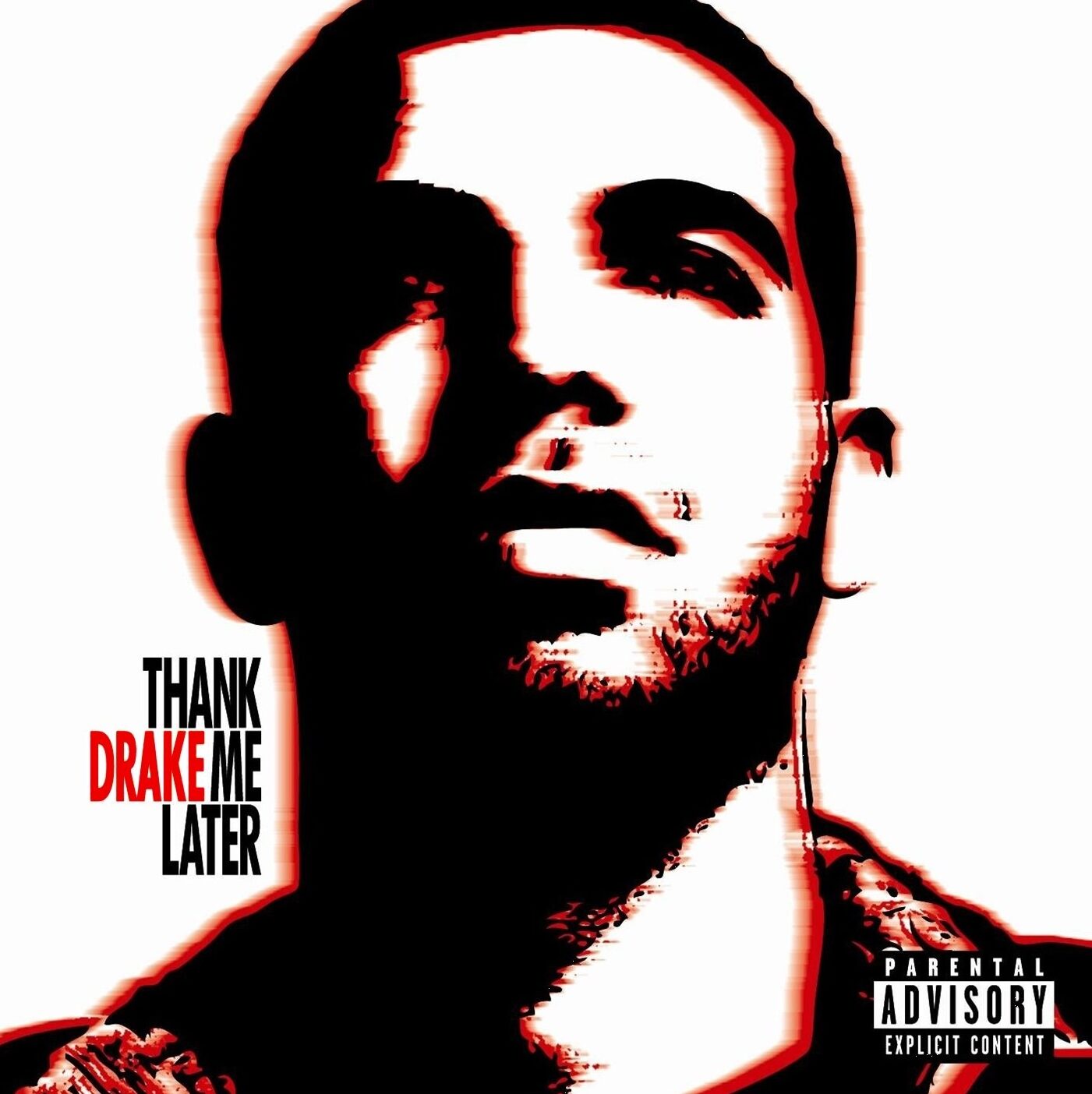
Drake’s Thank me Later vs. Kendrick’s Good Kid Maad City
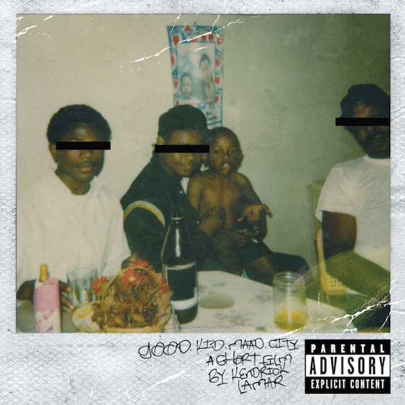
The immediate impression is a deeply personal one – from the grainy Polaroid to the handwritten font.
The original type is actually handwritten by Kendrick’s friend and collaborator Schoolboy Q, but the link above is a pretty faithful recreation. And say what you will about Schoolboy Q’s nails, the handwriting is great. If you’re interested in making your own version, check out our custom generators here.
The centered portrait combined with the off-center title gives Thank me Later a nice balance, and the minimal color scheme conveys a good amount of energy. The stencil style is oddly reminiscent of the famous Barak Obama Hope poster, and the timing implies it likely was a design influence here. Drake has sometimes been accused of “wave-riding” or copying emerging styles and trends in music, and the art used here certainly doesn’t do much to dissuade that.
Debatable inspiration aside, the font used here isn’t a great match for the motif, and relying on color alone to keep your text from becoming jumbled nonsense is never a good idea, especially when red displays nearly identical to black in grayscale.
But Thank me Later can’t compete with the raw authenticity of Good Kid Maad City, which perfectly sets the stage for the coming emotional journey, and ties in directly with the subject matter of the concept album. The slightly muted colors, the subtle scuffs, and the handwritten font – positioned to look like real writing on the photo, further emphasize the visual theme.
Their sophomore followups:
Drake’s Take Care vs. Kendrick’s To Pimp a Butterfly
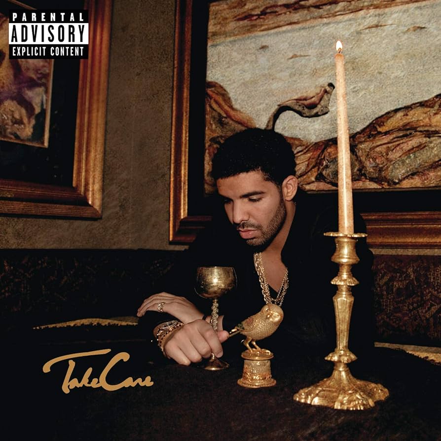
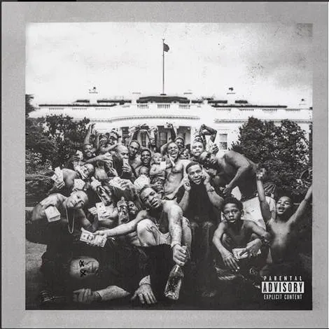
Both album covers are pretty solid in terms of representing their respective contents. Drake’s Take Care sets the stage for a personal journey exploring fame, wealth, and romance. While Kendrick Lamar’s To Pimp a Butterfly album cover previews the controversial social issues highlighted within.
Again, both are fairly minimal as far as composition, allowing the photography to be the uncontested focal point. Aside from subject matter, their most obvious difference is color: Drake using gold to emphasize fame and fortune, Kendrick using grayscale and distressed texture to evoke a more raw feel.
Self portraits:
Drake’s Nothing Was the Same vs. Kendrick Lamar’s DAMN


Odd that Kendrick’s most radio-friendly work to date has his least accessible cover.
The title font is Times, but you already knew that one.
This time it’s Kendrick who can be accused of wave-riding. Showcased prominently on Kanye West’s The Life of Pablo cover, anti-design was the trending aesthetic of the time, which typically uses standard system fonts, simple layouts, and overlapping content.
Article in progress – more coming soon!
