
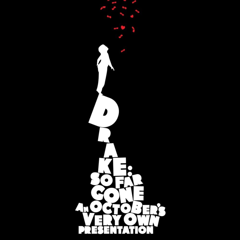
You’re probably familiar with the art for So Far Gone if you landed here, but did you know it’s a pretty blatant rip-off?
Maybe rip-off is too strong a word, but by the artists own admission “I sent him a bunch of art that I said I would love to flip and he selected The Economist ad. I flipped the text and instead of a spider the kid was curious about, we added money and hearts. It just felt right with the vibe of the mixtape.”
The “Inspiration” for the cover art
The artist himself, known as Darkie admits to what he calls “flipping” the art of an original piece from an ad in The Economist. We won’t debate the line between homage and copying here, but you can see the two are quite similar:

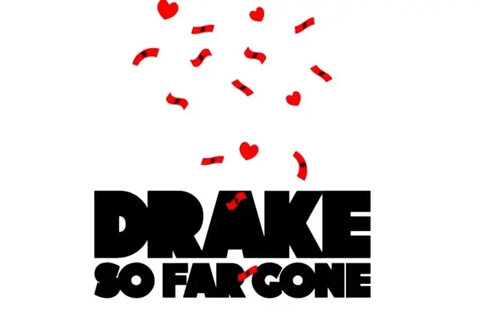
The font used for So Far Gone
Another piece of the So Far Gone branding gives us a better look at the font, and although it has some very similar characteristics to Futura Extra Bold, it shares more in common with Genera Alt Black.
