
There are two different album covers for Flower Boy, both great for different reasons – here we explore the (lack of) fonts used.
Tyler, The Creator’s “Flower Boy,” released in 2017, is a stand-out in his catalogue, regarded by many as Tyler’s best work to date. The album’s cover art, featuring vibrant colors, surreal landscapes, and an array of blooming flowers, reflects the themes of self-discovery and personal growth within the music. The choice of font, a clean and modern sans-serif typeface, complements the whimsical and imaginative visuals, creating a cohesive and striking aesthetic.
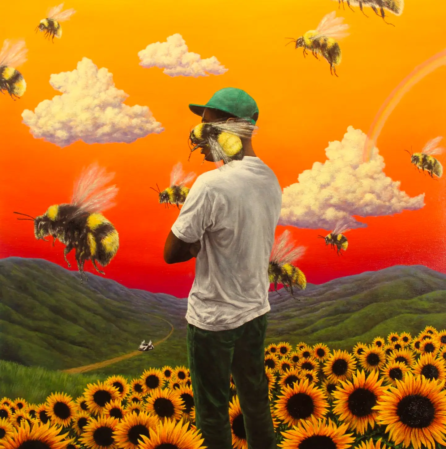
Main cover art for Flower Boy
Album covers in recent years have been trending towards minimal text, this art being one such example. We aren’t complaining though, the art used here is beautiful and the lack of text allows the focus to be completely on the striking, surreal visuals.
If you’re interested in our art review of the main cover you can read that here.
For identifying a font we’ll turn to the alternate cover:

Flower Boy alternate cover art
On the alternate cover we can clearly identify Arial by Monotype being used: in Black weight for the main title (showing the albums original name “Scum Fuck Flower Boy”) and Regular for supplementary text. This album cover was supposedly designed by Tyler The Creator himself, so it makes sense that it uses a fairly well-known font. Not the mention it was released at the height of anti-design’s resurgence in pop-culture.
Try out our Flower Boy Text Generator here if you want to create your own version, and check out the generators for IGOR and CHROMAKOPIA too.
