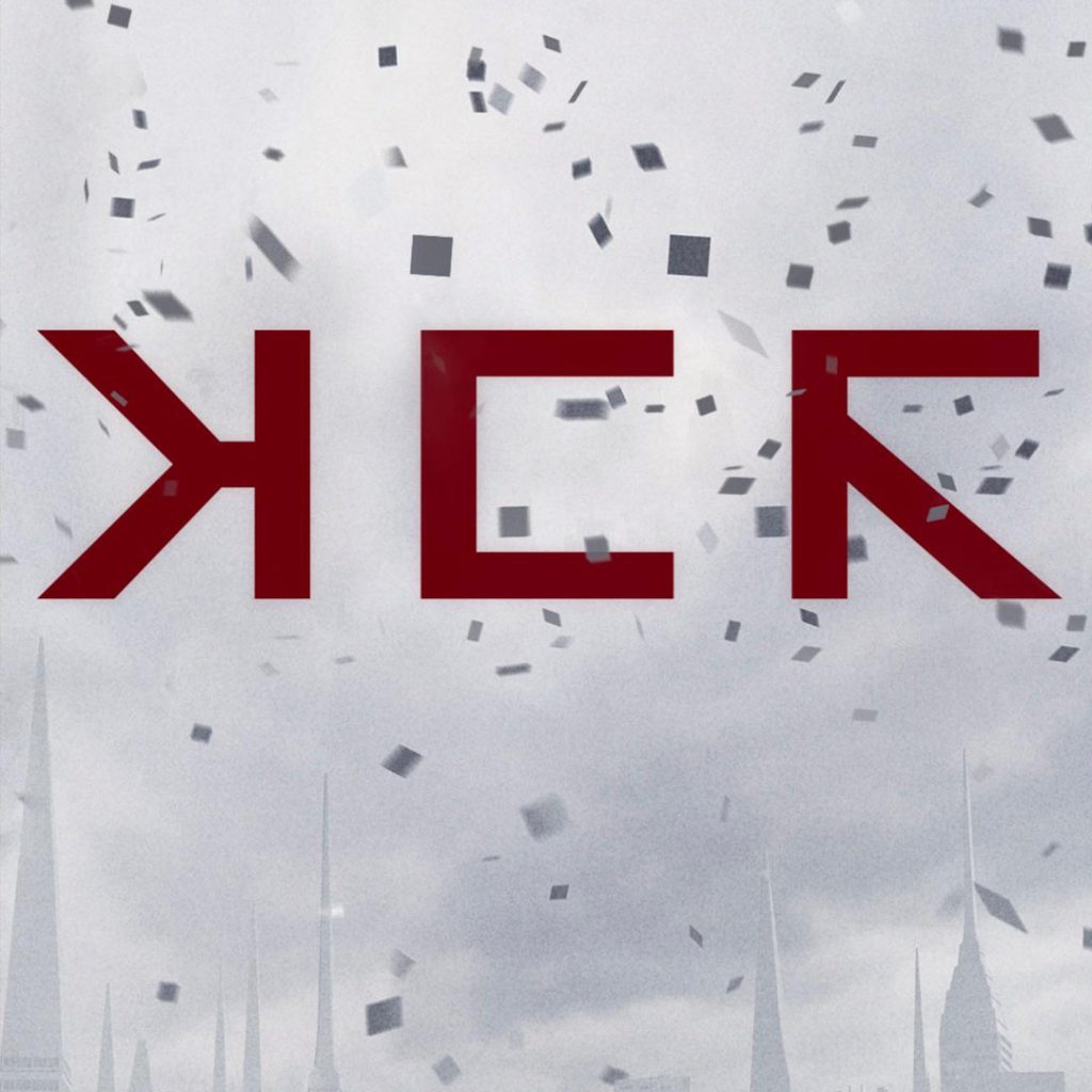
Generate custom images based on the MCR “Love Live the Black Parade” teaser image.
We don’t know yet what the mysterious teaser image from My Chemical Romance represents (but there are signs it’s related to the long rumored The Paper Kingdom album). The image features a beautiful yet foreboding trio of bold minimalist square letters against a gray sky – and if you’re excited about what it all means use this generator to create your own custom version.
Remember to tag us on social media with your creations: X Facebook Instagram and TikTok
sample text
For exclusive early access to new album generators, please join our mailing list. No spam or ads, just simple email alerts when new generators are created.
The Bold Visual Identity of My Chemical Romance’s “Long Live The Black Parade” Era
A New Chapter in Theatrical Rock
My Chemical Romance’s return to “The Black Parade” concept through their “Long Live The Black Parade” tour marked a bold evolution in the band’s visual storytelling. The promotional materials and tour design featured striking red block typography that commanded attention—a departure from the original 2006 album’s black-and-white marching band aesthetic while maintaining the theatrical grandeur that defined the project.
The Power of Red Block Lettering
The choice of bold red block text for the “Long Live The Black Parade” campaign created an immediate visual impact. This typographic approach—characterized by solid, geometric letterforms in vibrant red—evoked urgency and emotion while remaining distinctly readable. The design philosophy prioritized clarity and boldness, ensuring the message cut through the noise of contemporary music marketing.
This emphasis on strong, straightforward typography echoed design principles found throughout rock history. Much like Oasis’s iconic rectangular badge logo that used Helvetica Black Italic to convey confidence and authenticity, My Chemical Romance’s red block text communicated strength and revival. Both bands understood that in rock music, visual identity must be as uncompromising as the sound.
Gerard Way’s Design Sensibility
Gerard Way, MCR’s frontman and primary visual architect, has consistently brought his background in comic book art to the band’s aesthetic choices. His understanding of color theory, composition, and narrative drove the “Long Live The Black Parade” visual campaign. The bold red served multiple purposes: it symbolized passion, danger, and the lifeblood of the concept album’s ongoing legacy.
Way has spoken openly about his musical influences, citing bands that married strong visual identities with revolutionary music. Green Day’s impact on MCR’s approach to concept albums cannot be overstated. When Green Day released “American Idiot” in 2004, they demonstrated how punk bands could create ambitious, politically charged rock operas with cohesive visual branding. The album’s hand-grenade heart logo and bold graphic novel aesthetic showed Way and his bandmates a blueprint for theatrical punk rock.
The Lineage of Theatrical Rock Design
My Chemical Romance’s visual evolution can be traced through multiple influences. While “American Idiot” provided a contemporary template for punk rock theatricality, the band also drew inspiration from earlier eras. Green Day’s own journey—from the raw energy of “nimrod” to the polished conceptual ambition of “American Idiot” and later the mature craftsmanship of “Saviors”—illustrated how bands could evolve their visual identities while maintaining core authenticity.
The British rock tradition also played a significant role in shaping MCR’s aesthetic sensibilities. Oasis, whom Gerard Way has acknowledged as an inspiration, proved that straightforward, bold design choices could become iconic. The Manchester band’s confidence in their visual identity—refusing to overcomplicate or obscure their message—resonated with Way’s own design philosophy. Both bands understood that sometimes the most powerful statement comes from absolute clarity.
Red as a Symbolic Choice
The specific selection of red for “Long Live The Black Parade” carried deep symbolic weight. Red has long been associated with passion, revolution, and vitality in rock music. The color choice transformed the somber, funeral march aesthetic of the original “Black Parade” into something more vital and urgent—a celebration of survival and continuation rather than an ending.
This chromatic shift reflected the tour’s purpose: not merely to revisit past glory, but to reanimate and extend the narrative. The bold block typography in red announced that “The Black Parade” was not a relic but a living, breathing entity. The design communicated defiance and perseverance, themes that have always run through My Chemical Romance’s work.
Typography and Legibility in Rock Design
The block typography style employed in the campaign prioritized maximum legibility without sacrificing impact. In an era of increasingly complex and ornate band logos—particularly in alternative and metal subgenres—MCR’s choice to use clean, bold letterforms was almost radical in its simplicity. This approach ensured the message could be read from festival stages, on small phone screens, and everywhere in between.
This design strategy aligned with a tradition of effective rock typography. Green Day’s various logo treatments across their discography—from the simple wordmark of “nimrod” to the more elaborate designs of later albums—always maintained readability as a core principle. Similarly, Oasis’s use of Helvetica demonstrated that a proven, legible typeface could become iconic through consistent application and bold presentation.
The Campaign’s Visual Ecosystem
Beyond the typography itself, the “Long Live The Black Parade” campaign created a complete visual ecosystem. Promotional materials, merchandise, stage design, and social media content all reinforced the red and black color scheme. This cohesive approach to branding reflected lessons learned from decades of rock marketing, where consistency across touchpoints builds recognition and emotional connection with fans.
The campaign also demonstrated an understanding of how visual identity functions in the digital age. The bold red text translated effectively across platforms—from Instagram posts to TikTok videos to massive LED screens at arena shows. This versatility echoed the timeless quality of classic rock logos like Oasis’s rectangular badge, which worked equally well on a t-shirt or a festival banner.
Nostalgia and Innovation
“Long Live The Black Parade” succeeded in balancing nostalgia with innovation. The campaign honored the original album’s legacy while presenting it through a fresh visual lens. The red block typography served as a bridge between past and present, acknowledging what came before while pushing the narrative forward.
This balance is crucial for legacy acts and reunion tours. Green Day has navigated similar territory, particularly with anniversary tours for “American Idiot” and continued evolution through albums like “Saviors.” These bands demonstrate that looking backward doesn’t require stagnation—visual and musical identities can honor history while embracing contemporary expression.
Impact on Contemporary Rock Aesthetics
My Chemical Romance’s bold typographic choices for this era have influenced a new generation of bands considering their own visual identities. The success of the campaign—measured both in ticket sales and cultural conversation—proved that strong, clear design still resonates with rock audiences. In an oversaturated visual landscape, simplicity backed by confident execution stands out.
The red block text of “Long Live The Black Parade” joined a lineage of iconic rock typography that includes everything from the clean minimalism of Oasis’s logo to the rebellious energy of Green Day’s various visual eras. Each of these design choices reflected their respective band’s ethos while creating instantly recognizable branding that transcended typical music marketing.