
How to Use the Radiohead The Bends Cover Generator
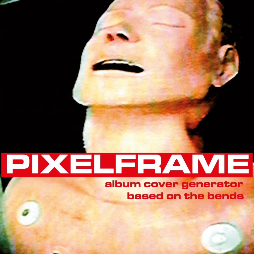
Creating your own album cover in the style of Radiohead’s The Bends is remarkably simple. Start by entering your primary text in the first text field—this will appear in large, bold white letters against the signature red background bar. Next, add your text in the second field, which will be rendered in smaller red text below the main banner, perfectly aligned to echo the original design’s asymmetric balance. Click “Generate Cover” to see your custom text come to life!
For exclusive early access to new album generators, please join our mailing list. No spam or ads, just simple email alerts when new generators are created.
The art and font of The Bends
The Bends album cover, designed by Stanley Donwood and Thom Yorke (working under his pseudonym “Dr. Tchock”), represents a masterclass in minimalist graphic design that achieves maximum emotional impact. At its core is the Microgramma Bold Extended typeface—a geometric sans-serif font originally designed by Aldo Novarese in 1952 for the Nebiolo Type Foundry. This futuristic, architectural font had been used in science fiction contexts for decades, but The Bends reclaimed it for something far more human and vulnerable.
The choice of Microgramma wasn’t accidental. Its squared-off, wide letterforms create an imposing, almost industrial presence that contrasts beautifully with the distressed, deeply personal photograph of the CPR training mannequin that forms the cover’s central image. The font’s mechanical precision clashes against the raw emotional content of the album itself, creating a visual tension that mirrors the music’s exploration of alienation, anxiety, and the struggle to connect in an increasingly technological world.
The color palette is deceptively simple yet incredibly effective: vibrant red (#e20612) and pure white create maximum contrast and immediate visual impact. The red bar cutting across the center of the composition demands attention, functioning almost like a censorship bar or emergency broadcast banner—appropriate for an album dealing with psychological crisis and emotional emergency. This bold stroke of color became so iconic that it would influence album design for years to come, proving that sometimes the most powerful statements are also the simplest.
Themes and Context: The Bends in Radiohead’s Evolution
Released in March 1995, The Bends arrived at a crucial moment in Radiohead’s career and in rock music history. Following the unexpected worldwide success of “Creep” from their debut Pablo Honey, the band faced intense pressure and skepticism. The Bends was their answer—a sophisticated, emotionally complex album that proved they were far more than one-hit wonders.
The album’s title refers to decompression sickness, the painful and potentially fatal condition experienced by divers who surface too quickly. It’s a perfect metaphor for the themes Yorke explores throughout: the crushing pressure of modern life, the pain of rapid change, the feeling of being unable to adapt to your environment. Songs like “Fake Plastic Trees,” “Street Spirit (Fade Out),” and the title track itself grapple with authenticity, mortality, and existential dread—all wrapped in soaring guitar arrangements and Yorke’s distinctive falsetto.
What makes The Bends so significant in Radiohead’s discography is its position as a bridge between worlds. It refined the guitar-driven alternative rock of their debut while planting seeds for the radical experimentation that would define OK Computer (1997) and beyond. You can hear the band beginning to push against the boundaries of traditional rock structures, incorporating electronic elements and unconventional song arrangements that would explode into full flower on subsequent releases.
From The Bends to Kid A: A Journey Through Sound and Vision
Understanding The Bends becomes even richer when viewed as part of Radiohead’s broader artistic journey. The album’s relatively conventional rock instrumentation and song structures would give way to the paranoid, technology-obsessed soundscapes of OK Computer, which in turn exploded into the complete reinvention of Kid A (2000).
Kid A represented Radiohead’s most radical departure—abandoning guitars almost entirely in favor of electronic textures, ambient soundscapes, and fragmented song structures influenced by Krautrock and experimental electronica. The album cover for Kid A, featuring abstract mountainous landscapes, was as deliberately obscure and non-commercial as The Bends’ design was bold and direct. Where The Bends shouted its presence with that red bar and Microgramma text, Kid A whispered through oblique imagery and hidden meanings.
Yet both albums share a commitment to emotional honesty and artistic integrity. The Bends’ raw vulnerability and Kid A’s alienated abstraction are different expressions of the same artistic fearlessness. This evolution continued through In Rainbows (2007), where the band achieved a remarkable synthesis—combining the emotional directness and melodic accessibility of The Bends era with the sonic experimentation developed through Kid A and Amnesiac. In Rainbows’ watercolor artwork by Stanley Donwood reflected this balance: colorful and inviting yet abstract and dreamlike.
Why The Bends Endures
Nearly three decades after its release, The Bends remains a touchstone for alternative rock and a masterclass in album design. The cover’s bold typography and color blocking have been endlessly imitated but never quite duplicated. It proved that album artwork didn’t need to be elaborate or photorealistic to be memorable—sometimes a striking photograph, a well-chosen typeface, and confident use of color are all you need.
For musicians and designers today, The Bends offers valuable lessons in visual communication. The Microgramma font conveys authority and impact without overwhelming the composition. The red-and-white palette creates instant recognition. The asymmetric layout—with the band name dominating the center and the album title positioned below—creates dynamic tension that draws the eye.
This generator allows you to tap into that same design philosophy, creating covers that feel both contemporary and connected to one of the most important albums in rock history. Whether you’re releasing your own music, creating playlist covers, or simply exploring graphic design principles, The Bends aesthetic offers a proven template for making bold, memorable visual statements.




yay