
Enter your text in the box below the image and click “Generate Cover”.
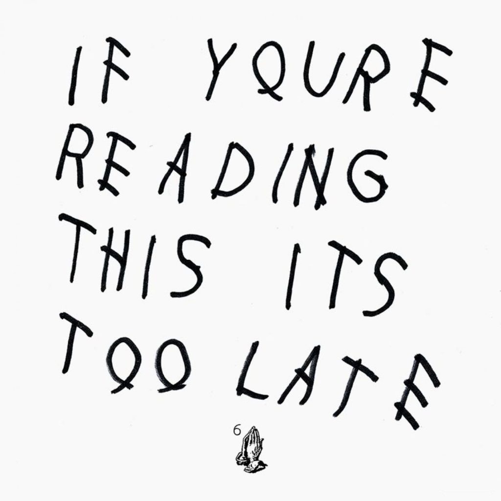
Ever wanted to put your own spin on Drake’s iconic album cover? Now you can! This generator lets you create a personalized version of the “If You’re Reading This It’s Too Late” album artwork. Simply type in your text, hit generate, and watch as your words transform into Drake’s distinctive handwritten style. Perfect for social media posts, custom wallpapers, or just for fun.
sample text
The Art of the Surprise Release
“If You’re Reading This It’s Too Late” arrived with minimal warning, dropped suddenly onto streaming platforms through OVO Sound in the early hours of a February morning. The cover’s stark aesthetic perfectly matched this guerrilla release strategy—it feels spontaneous and direct, like a message scrawled quickly before disappearing into the night. The handwritten quality suggests urgency and authenticity, as if Drake himself penned this note moments before the release (Kanye West would later directly or indirectly pay homage with the cover for Ye). For a version sized for phone wallpapers, try out the new IYRTITL Wallpaper Generator. And be sure to check out the More Life cover generator for more classic Drake.
This approach to surprise releases and understated visual presentation influenced how major artists approached album rollouts. Artists like Kanye West had experimented with unconventional releases before, but Drake’s combination of mysterious text-only visuals and unexpected timing created a template that artists from 21 Savage to J Cole would reference in their own strategic album drops.
Handwritten Intimacy in the Digital Age
The handwritten quality of the typography creates profound intimacy despite—or perhaps because of—the cover’s overall minimalism. In an increasingly digital world, handwriting suggests personal touch, human connection, direct communication from artist to listener. It feels like Drake himself wrote this message, even though it was surely created by a designer translating his handwriting into the final cover.
This combination of personal typography with radical simplicity connects Drake’s approach to artists like ASAP Rocky, who’ve similarly used handwritten or custom lettering to create intimate connections with audiences. The choice communicates that despite Drake’s massive fame, this project feels personal and direct. Artists like Lil Baby have since embraced similarly stripped-down typographic approaches, understanding that clarity and directness can cut through visual noise.
The cover’s elegant simplicity gave it crossover appeal beyond traditional hip-hop audiences. The artistic typography and sophisticated minimalism could attract listeners across genres, from Justin Bieber‘s pop audiences to alternative music fans drawn to refined aesthetics. This visual accessibility matched Drake’s musical approach—creating hip-hop that draws from R&B, pop, and other influences to reach the broadest possible audience.
Artists like Shaboozey, who blend hip-hop with country and rock influences, similarly understand that visual presentation can signal openness to diverse audiences. The text-only cover communicates artistic seriousness without alienating potential listeners through genre-specific visual codes.


Brat album
rahhhhh
thats right I’m kendrick