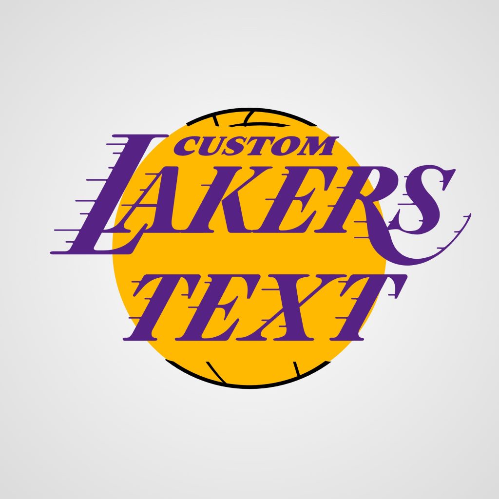
Create your own version of the iconic Los Angeles Lakers NBA team logo with this custom Font & Logo Generator
The original logo designers for the Los Angeles Lakers basketball team left no creative stone unturned – ultimately landing on the cutting-edge iconography of…a basketball…for a basketball team logo. Whereas the NY Knicks at least included a triangle in their logo to provide some dimension, the LA Lakers slapped some text over the basketball and said “good enough”. But simple doesn’t mean bad, and their iconic logo has gone on to represent the West Coast for decades, becoming one of the most recognizable sports logos in the world. Type any text to create your own version of this piece of LA history!
For exclusive early access to new album generators, please join our mailing list. No spam or ads, just simple email alerts when new generators are created.
Few emblems in sports are as instantly readable from across a room as the Los Angeles Lakers logo — a purple wordmark racing across a gold basketball, motion lines trailing behind it like the ball is mid-shot. The new Lakers Font & Logo Generator recreates that construction from the ground up, letting any city name and team name run through the same two-layer basketball, the same oversized first-letter treatment, and the same purple-and-gold color language the real logo has carried for over sixty years.
How the Lakers generator works: a layer-by-layer breakdown
The logo is built from two independent pieces that are measured before either one is drawn: a basketball made of two flat vector layers, and two lines of text sized and positioned around it. Each sample below renders live in your browser using the same fonts, shapes, and layering order as the generator itself, with the demo text "Los Angeles" and "Lakers."
Layer 1: The basketball's orange base
Every graphic starts with a flat orange circle, drawn first so it sits behind everything else. Its size is derived from the width of the team-name text once that text has been measured, so a short word and a long one both get a ball sized to match, rather than one fixed circle stretched or shrunk to fit.
Layer 2: The seam-line pattern, with a text-shaped cutout
A second, slightly larger layer sits on top of the orange base, carrying the basketball's black seam lines. Before that layer is drawn, a thick stroked duplicate of both text blocks is used as a stencil to punch a text-shaped hole through it — a step that never appears on screen itself, but leaves a clean gap so the seam pattern doesn't crowd the letters once they're drawn on top.
Layer 3: The small city name, indented past the first letter
The smaller line of text sits above the main wordmark, left-aligned rather than centered, and nudged inward by a percentage of the big text's own letter size. That indent exists so this smaller line clears the oversized first letter of the word below it instead of overlapping it — a detail pulled directly from how the real Lakers wordmark tucks "Los Angeles" in above the "L" in "Lakers."
Layer 4: The team name, with an oversized first letter
The main wordmark uses a font where the first letter of the word renders taller than the letters that follow it, the same effect that gives the real logo's "L" its height over the rest of "akers." Only the first character of whatever's typed gets capitalized — every other letter is forced to lowercase, even across a second word or a wrapped line, so the oversized-first-letter effect always lands on the correct character no matter what's typed.
Layer 5: The white outline, for darker backgrounds
On the purple and black background options, a white duplicate of both the basketball and the text is added behind everything else. The ball's white duplicate is drawn slightly larger than the orange layer on top of it, forming a thin visible ring. The text's white duplicate sits behind the basketball entirely, so it only shows through in the places where a letter extends past the ball's own silhouette — everywhere else, the basketball simply covers it.
The history behind the Lakers logo
The Lakers didn't start in Los Angeles, and they didn't start with a basketball-and-motion-lines logo either. The franchise began in 1947 after new owners purchased a struggling minor-league team and moved it to Minneapolis, Minnesota, a state known for its ten thousand lakes — which is exactly where the name came from. The original Minneapolis Lakers logo leaned hard into that identity, built around a map of Minnesota, a star marking the team's home city, and the wordmark "MPLS Lakers" wrapped around the shape rather than a basketball at all.
That changed in 1960, when the team relocated to Los Angeles. Every piece of the old Minnesota-specific branding was dropped, and the design that replaced it centered on a basketball for the first time, with "Los Angeles Lakers" lettered diagonally across it and thin lines trailing off to one side to suggest speed. The purple and gold color pairing arrived not long after, chosen for the sense of richness and prestige the combination carries, and it's stuck with the franchise through every version of the logo since. Later refinements through the 1990s and into the 2000s sharpened the typography and thickened those motion lines, but the underlying idea — bold lettering racing across a gold ball — has stayed remarkably intact since the move west.
That kind of longevity is unusual in sports branding, where a full redesign every decade or two is closer to the norm. It puts the Lakers in a similar position to a franchise like the Green Bay Packers, whose oval emblem has likewise barely changed since it was introduced — both logos lean on the idea that a design people have looked at for decades becomes part of the team's identity in a way a fresh update rarely manages to replicate.
Themes and creative uses
The two-input structure behind this generator isn't limited to recreating the real Lakers wordmark exactly as printed. Because the city name and team name are handled as two separate, independently sized lines, the same layout works for a rec-league team, a fantasy basketball franchise, or any city-and-mascot pairing that fits the same two-line shape — the indent, the oversized first letter, and the basketball's sizing all adjust automatically to whatever's typed.
That same logic — a compact identifying word sitting above a larger, more decorative main wordmark — shows up across plenty of team branding outside basketball too. The New York Knicks generator works through a similar layered-shape and wordmark relationship for a completely different sport, and it's a useful side-by-side for anyone curious how two NBA franchises in different cities solve a related design problem with very different color language and shape choices.
Using the generator
Two text fields drive the graphic: a smaller line for the city name, automatically capitalized in full, and a larger line below it for the team name, where only the first letter stays capitalized and everything else is forced to lowercase. Either field can be left blank — with no team name entered, the city line simply centers itself instead of indenting off the wordmark below it.
Four background options sit above the text fields: a soft white-to-gray gradient, solid purple, solid gold, and solid black, with the white basketball-and-text outline switching on automatically for the purple and black options. Clicking a new background regenerates the graphic instantly using whatever text has already been entered. Once the result looks right, the Download button saves a high-resolution JPEG ready to use anywhere.
More sports logo generators
The Lakers wordmark joins a growing lineup of tools built around team and league branding, each one studying its own specific shape language rather than reusing one generic template stretched across different sports.
For motorsport rather than basketball, the NASCAR logo font generator works with a similar sense of speed and motion baked into its lettering, even though the underlying shapes and colors are built entirely differently. On the football side, the New England Patriots generator and the Green Bay Packers generator both explore how a single emblem can anchor decades of team identity, one through a more modern silhouette and the other through the kind of long-running consistency mentioned above.
And for a franchise that shares the Lakers' own home city but nothing else about its visual language, the LA Dodgers logo generator makes an easy comparison — proof that "Los Angeles team" can mean a script wordmark and a completely different color story just as easily as it can mean purple, gold, and a basketball.