
Create Your Own Iconic Album Cover in the Style of Joy Division’s Unknown Pleasures
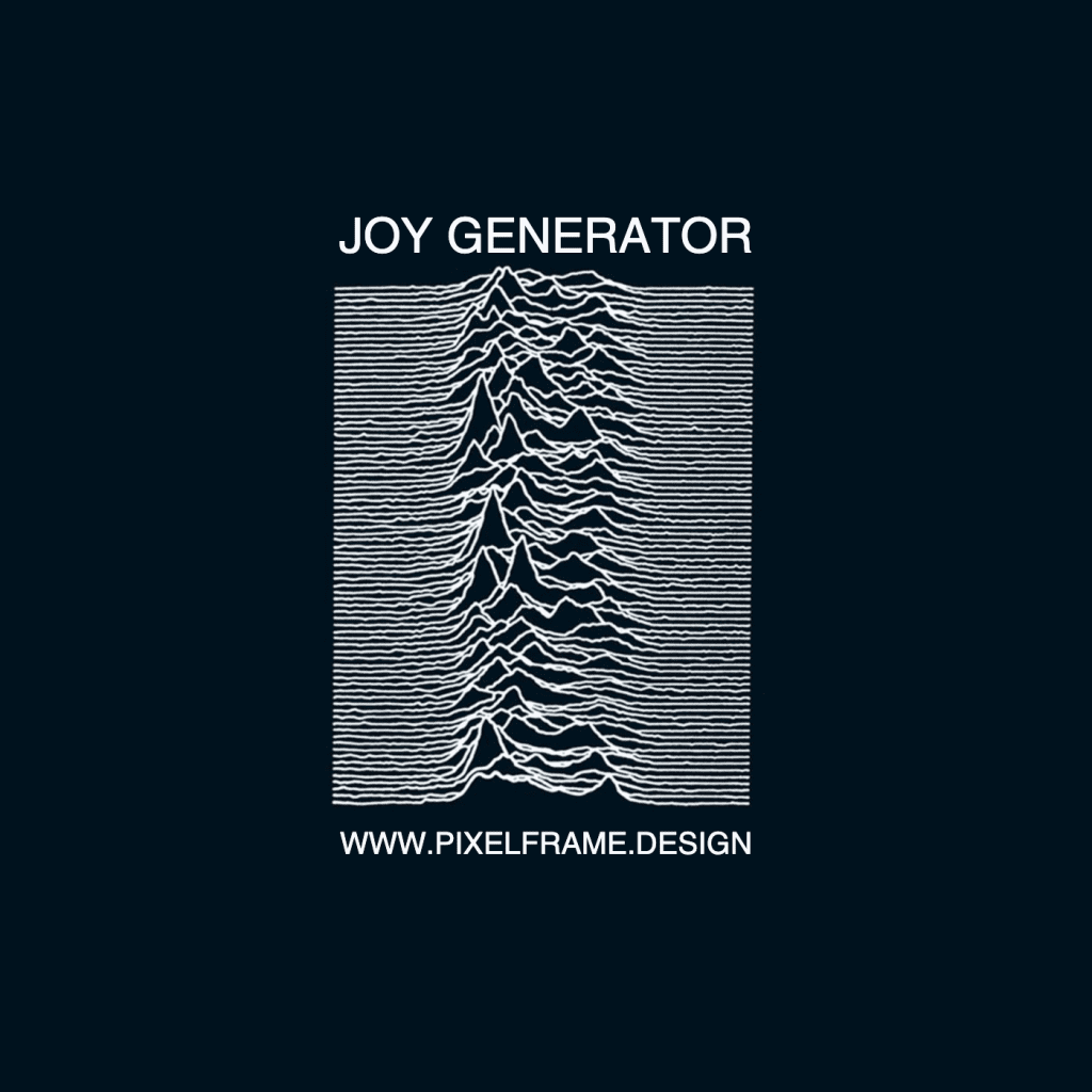
The generator offers a straightforward way to create personalized album artwork inspired by one of the most recognizable designs in music history. Users simply enter two text inputs: the top text (equivalent to the artist or band name) and the bottom text (representing the album title). Both fields accept any combination of letters, numbers, and characters, which the generator automatically converts to uppercase to match the original aesthetic.
For exclusive early access to new album generators, please join our free mailing list. No spam or ads, just simple email alerts when new generators are created.
The Anatomy of an Iconic Design
Joy Division’s Unknown Pleasures stands as one of the most immediately recognizable album covers in music history, transcending its post-punk origins to become a cultural touchstone referenced across fashion, art, and popular culture. The cover’s power lies in its elegant simplicity: a black background featuring a series of white, stacked waveforms that create a three-dimensional topographic effect, bookended by the band name and album title in clean, sans-serif typography.
The design came from an unlikely source. When Joy Division approached Manchester-based designer Peter Saville for their debut album, they arrived with specific visual ideas. Among the materials they presented was a page torn from The Cambridge Encyclopedia of Astronomy, featuring a data visualization of radio waves emitted by pulsar CP 1919—the first radio pulsar ever discovered.
This image, originally created by astronomer Harold Craft at the Arecibo Observatory in 1970 for his PhD thesis, showed successive pulses from the pulsar, stacked vertically to display variations in signal strength over time. The pulsar emitted these signals at precise intervals of 1.337 seconds, creating a rhythmic pattern that translated into the undulating lines on the chart.
Saville recognized the visual potential immediately. The scientific diagram possessed an inherent beauty, a marriage of data and aesthetics that perfectly complemented Joy Division’s stark, atmospheric sound. Rather than elaborate or embellish, Saville made the brilliant decision to present the image with minimal alteration—inverted to white on black, stripped of axes and labels, and framed by simple typography. The result was a cover that felt simultaneously alien and familiar, scientific yet emotional, minimalist yet deeply complex.
Joy Division and Unknown Pleasures
Released on June 15, 1979, through Factory Records, Unknown Pleasures marked Joy Division’s entry into the post-punk landscape with a sound that would prove profoundly influential. The album was the only full-length release during frontman Ian Curtis’s lifetime, and it captured a band at the height of their creative powers.
Producer Martin Hannett’s production aesthetic matched Saville’s visual approach—both prioritized space, atmosphere, and restraint over conventional rock bombast. Songs like “Disorder,” “She’s Lost Control,” and “New Dawn Fades” showcased Curtis’s baritone vocals, Peter Hook’s melodic bass lines, Bernard Sumner’s angular guitar work, and Stephen Morris’s precise drumming, creating a sound that was simultaneously claustrophobic and expansive.
Factory Records, true to their unconventional approach, released no singles from the album, allowing Unknown Pleasures to stand as a complete artistic statement. This decision, combined with Saville’s striking cover design, established Factory Records’ reputation for treating albums as art objects rather than mere commercial products.
The album’s influence extends far beyond its immediate post-punk context. Its exploration of alienation, isolation, and mental health resonated with listeners then and continues to do so today. The music and artwork have become inseparable, each enhancing the other’s impact.
A Legacy in Black and White: The Lineage of Minimalist Album Art
Unknown Pleasures established a template for minimalist album artwork that designers and musicians have referenced, paid homage to, and reimagined for decades. The combination of stark black-and-white contrast, scientific or mathematical visualization, and restrained typography created a visual language that suggested sophistication, mystery, and artistic seriousness.
Arctic Monkeys’ 2013 album AM provides one of the most direct aesthetic descendants. The cover features a white sine wave on a black background, with the band name and album title in white typography. The design, created by bassist Nick O’Malley, stripped the concept down even further than Saville’s original—a single, simplified waveform rather than stacked pulsar data. The visual connection is unmistakable, and AM’s massive commercial success introduced this aesthetic approach to a new generation of listeners.
Vince Staples’ 2015 album Summertime ’06 offers another interpretation of the black-and-white minimalist tradition. Instead of waveforms, the cover features more literal ocean “waves”, The design’s dramatic simplicity and monochromatic palette recall Unknown Pleasures’ visual impact, demonstrating how the principles of that design—contrast, restraint, and powerful imagery—can be applied beyond the specific motif of data visualization.
Other artists have engaged more explicitly with the wave pattern itself. Clothing brands have endlessly appropriated the design, often without permission, transforming it into a ubiquitous fashion statement. Musicians from various genres have created their own variations, and the rise of data visualization as an art form owes a debt to Saville’s decision to repurpose Craft’s pulsar chart as album artwork.
In 2019, on the album’s 40th anniversary, astronomers at Jodrell Bank Observatory revisited pulsar CP 1919, making new observations as a scientific tribute to the cover that immortalized astronomical data in popular culture. This full-circle moment demonstrated the design’s unique position at the intersection of science and art.
Even Saville himself has revisited the design. In 2023, he reworked the iconic waves for Music Declares Emergency’s “No Music On A Dead Planet” campaign, flattening the undulating lines to represent the eternal silence of a dead planet—a powerful reinterpretation that demonstrates how the design’s visual language can be adapted to convey new meanings while retaining its essential impact.
The Enduring Power of Simplicity
What makes Unknown Pleasures’ cover art so enduringly powerful? Part of the answer lies in its accessibility—the design requires no explanation to be visually striking, yet rewards deeper investigation with layers of meaning and context. It bridges high and low culture, appearing equally at home in a gallery, on a concert poster, or on a t-shirt.
The design also benefits from its inherent ambiguity. To someone unfamiliar with its origins, the wave pattern might suggest mountains, sound waves, a heartbeat monitor, or purely abstract forms. This openness to interpretation allows viewers to project their own meanings onto the image, creating a personal connection that transcends the specific astronomical data it represents.
The Unknown Pleasures cover exemplifies the principle that effective design often involves knowing what to remove rather than what to add. Saville’s genius lay in recognizing that Craft’s pulsar diagram needed almost nothing beyond proper framing and presentation. The restraint of the design stands in contrast to the ornate, illustrated album covers common in progressive rock and heavy metal during the same era, making Unknown Pleasures feel both timeless and distinctly modern.




whens the bends?
soon bro!
ok
Done! https://pixelframe.design/the-bends/