
One Font Generator After Another
The title treatment for One Battle After Another — Paul Thomas Anderson’s 2026 Oscar Best Picture winner — features typography created by the renowned English artist Stanley Donwood. His signature approach to letterforms, which draws on stamp printing, linocut, and hand-carved block techniques, is immediately recognisable to anyone familiar with his long visual collaboration with Radiohead. That same raw, physically weighted quality runs through the film’s branding, lending the title a protest-poster authority that suits Anderson’s story of ex-revolutionaries and old debts.
For this generator, Donwood’s original letterforms were traced and rebuilt as a custom digital font, preserving the specific proportions, the hand-constructed irregularities, and the textural character of the source material. A distressed ink overlay was then layered into the text rendering to complete the effect, matching the worn, high-contrast quality of the original poster treatment.
For exclusive early access to new album generators, please join our mailing list. No spam or ads, just simple email alerts when new generators are created.
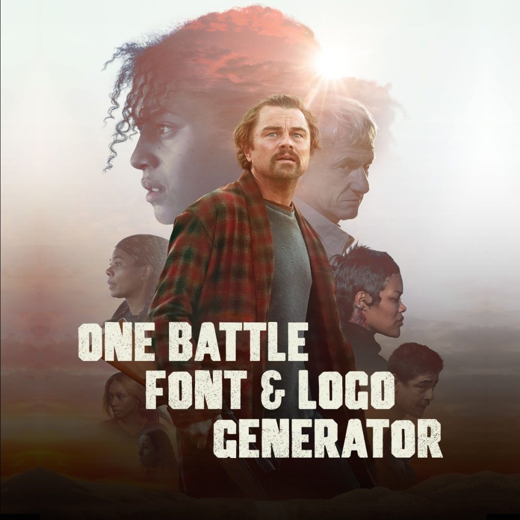
When Paul Thomas Anderson’s One Battle After Another arrived in cinemas in the fall of 2025, the title treatment was one of the first things people noticed. Heavy, chunky, slightly uneven block letters stacked in a descending staircase — it looked like something torn from a protest handbill, because in a sense it was. The generator on this page lets you recreate that look with your own text, using a custom font built directly from the letterforms Stanley Donwood drew for the film.
Where the Title Came From
Anderson confirmed in interviews that the phrase “one battle after another” was lifted almost verbatim from a pamphlet produced by the Weather Underground during the 1969 Days of Rage protests in Chicago. The full line from the original document read: “FROM HERE ON IT’S ONE BATTLE AFTER ANOTHER — WITH WHITE YOUTH JOINING IN THE FIGHT AND TAKING THE NECESSARY RISKS.” Anderson said the phrase had a ring to it he couldn’t shake.
In the film, Leonardo DiCaprio delivers the line as a quiet piece of voice-over just after the title card appears, turning a piece of radical protest literature into something almost resigned and weary. It’s a small but characteristic Anderson move — taking charged political language and quietly deflating it into the personal.
That protest-poster energy is baked directly into the logo’s design. The letterforms are thick and imposing, with the kind of rough weight you’d associate with a rubber stamp or hand-carved block print. They don’t aim for elegance. They aim for presence.
Stanley Donwood and the Logo Design
The title treatment for One Battle After Another was created by Stanley Donwood, the English artist and writer who has been Radiohead’s primary visual collaborator since 1994. Donwood — born Dan Rickwood — first met Thom Yorke while both were students at the University of Exeter, where Yorke was studying English and Donwood was studying Fine Art. Yorke reached out after graduating to ask Donwood to design the sleeve for the 1994 Radiohead single “My Iron Lung,” and the partnership has barely paused since.
Over thirty years, Donwood has created artwork for every Radiohead album, from The Bends to In Rainbows and beyond. He’s often described as the band’s unofficial sixth member. The OK Computer cover — one of the most recognisable album sleeves of the 1990s — was a Donwood and Yorke collaboration, as was the bold typographic treatment of The Bends and the rainbow-saturated stacking of In Rainbows. In 2002, Donwood and Yorke jointly won a Grammy Award for Best Recording Package for the special edition of Amnesiac.
Donwood’s visual style is hard to pin down precisely because it shifts so dramatically from project to project — from the bleak digital collages of OK Computer to the acrylic war-map paintings of Hail to the Thief to the egg tempera landscapes he produced alongside Yorke for The Smile. What holds his work together is a persistent sense of unease, a feeling that the surface of things is either coming apart or being held together with something improvised. That quality shows up in the One Battle After Another letterforms too — they feel handmade and slightly unpredictable, as though each character was carved under pressure.
The Smile Connection
The logo shares its DNA with lettering Donwood designed for The Smile, the trio comprising Thom Yorke, Jonny Greenwood, and drummer Tom Skinner. The Smile formed quietly during the COVID lockdowns and made their surprise debut at Glastonbury in 2021. Donwood created artwork for both of their studio albums, A Light for Attracting Attention (2022) and Wall of Eyes (2024).
The connection between Anderson and the Yorke-Greenwood circle is direct and ongoing. Anderson directed two music videos for The Smile — “Wall of Eyes” and “Friend of a Friend” — giving him a close working relationship with the people in Donwood’s orbit. When it came time to commission a logo for One Battle After Another, reaching out to Donwood was a natural extension of those existing ties.
Donwood painted the artwork for Wall of Eyes in a room at Abbey Road Studios while the band recorded in the adjacent space, with audio piped in as he worked. He has described this process of simultaneous composition — making visual art in direct response to music being made in the next room — as central to how he works. Whether the OBAA lettering emerged from a similarly immersive process isn’t documented, but the rawness of the result suggests something made with instinct rather than committee.
The Letterforms Themselves
The One Battle After Another logo is set entirely in capitals. The letters are wide, blocky, and slightly irregular — not in a way that reads as accidental, but in a way that reads as deliberate and hand-constructed. There’s a faint textural quality to the fills, like ink pressed into rough stock. The overall effect is somewhere between a wartime poster and a stadium-rock screen print.
The staircase layout — each line stepping progressively inward — is part of what makes the composition distinctive. It mirrors the cumulative weight of the title itself. The first line sets up the rhythm, the second continues it, and the third lands with finality. It’s a typographic structure that reinforces the meaning: not one thing, but a series, each one pressing down on what came before.
For this generator, a custom font was built by tracing Donwood’s original letterforms character by character, preserving the specific proportions, the slight irregularity of the stroke widths, and the textural fill that makes the original feel like a physical object rather than a screen asset. The three text inputs replicate the three-line stagger of the original layout, letting you place any text you choose into that same descending structure.
How to Use the Generator
Type your text across the three line inputs — one line per field. Each line steps inward as you move down, matching the staircase composition of the original logo. The group is automatically centered on the canvas so everything stays balanced whether you fill one line, two, or all three.
The font size adjusts automatically to fit your text, so longer phrases will scale down to stay within the canvas. If a single line is long enough to wrap, the wrapped continuation stays left-aligned to the same stagger position and pushes subsequent lines down accordingly.
Two modes are available. Poster Art places the text over the film’s key art background — a dense, painterly composition that provides a dark base for the off-white lettering. The Black Background version puts the same text on a clean black field, giving the letterforms maximum contrast and a graphic directness closer to the original protest-print spirit of the title’s source material.
Once generated, download the result as a JPG at 1200×1200 pixels — large enough for most print and digital uses.
Donwood Beyond the Screen
For anyone who wants to dig deeper into Stanley Donwood’s visual world, the Radiohead catalogue is the obvious starting point. The range of approaches across those albums — from the cold digital geometry of OK Computer to the warm colour stacking of In Rainbows — gives a sense of how adaptable his aesthetic intelligence is. Each project produces something that feels inevitable in retrospect, as though the visual and the musical were made by the same hand, even when they weren’t literally.
One Battle After Another adds a new chapter to that record. A film logo is a different challenge from an album sleeve — it has to work at billboard scale and thumbnail scale, in motion and in stillness, as marketing and as art. Donwood’s solution is characteristically uncompromising: letters that carry their own physical weight, a layout that tells its own small story, a texture that makes you feel the effort of having made it.
fun fact:jonny greenwood did the soundtrack for this movie and he is the guitarist for radiohead